Plume Café
A Leeds café with a flamingo hidden in its wordmark and an open door as its whole point.
- Sector
- Café & Events
- Services
- Branding, Brand Book
- Year
- 2025
“Grace in every little detail.”
The brief
A café that had to feel like a welcome, not a counter.
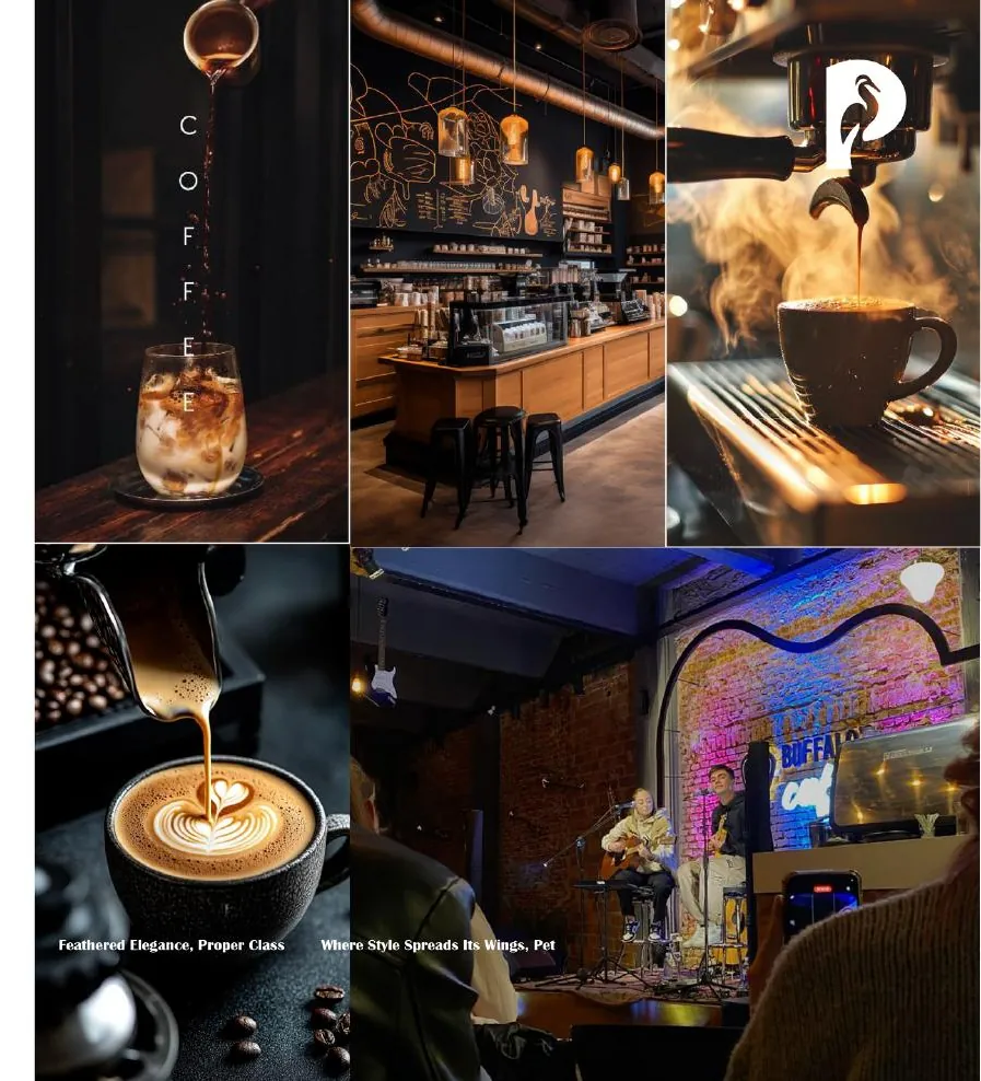
Plume Café is a vibrant space in Leeds inspired by the elegance of a feather and the bold spirit of a flamingo — exceptional coffee and food alongside events like Plume Stories and Plume After. The brief was a brand that could be a trusted hub for connection and celebration, serving a genuinely mixed room: students, families, professionals and the LGBTQ+ community.
The idea
Hide the flamingo in the negative space.
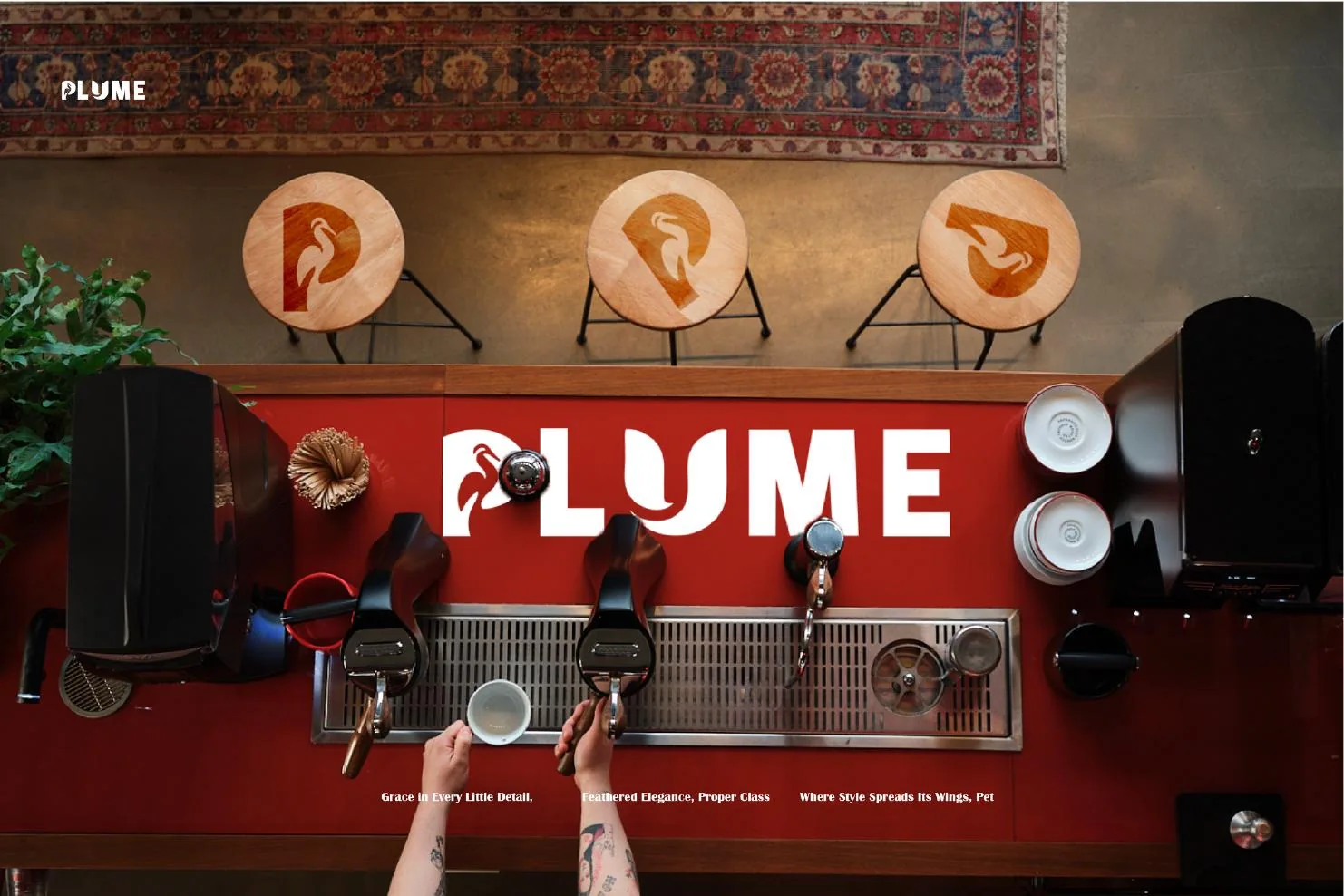
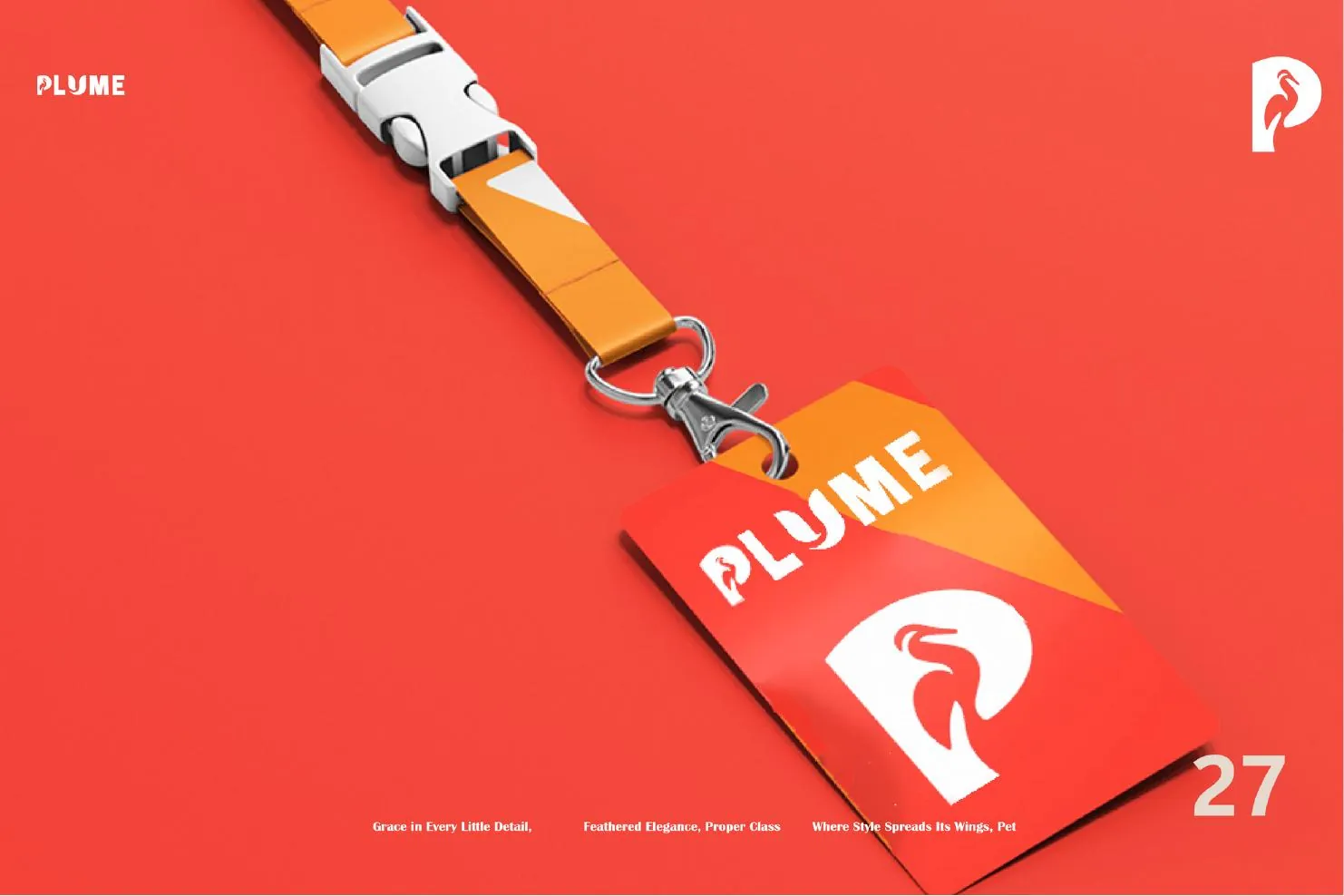
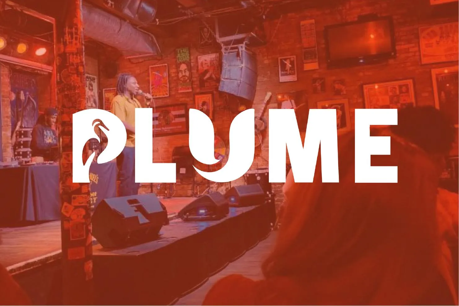
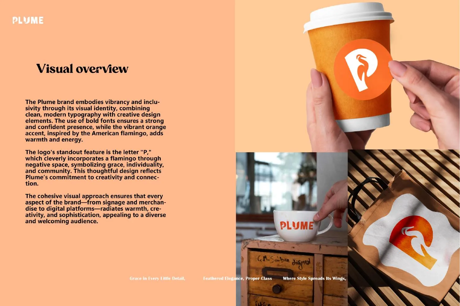
The wordmark's U is cut so its counter forms a flamingo — a mark that rewards the second look and gives the café an icon that can stand alone on a cup, an apron or a lanyard. The flamingo carries individuality and vibrancy; the feather carries the grace. Orange does the rest: warm, confident, and impossible to miss on a Leeds street.
The outcome
Elegance and boldness in the same system.
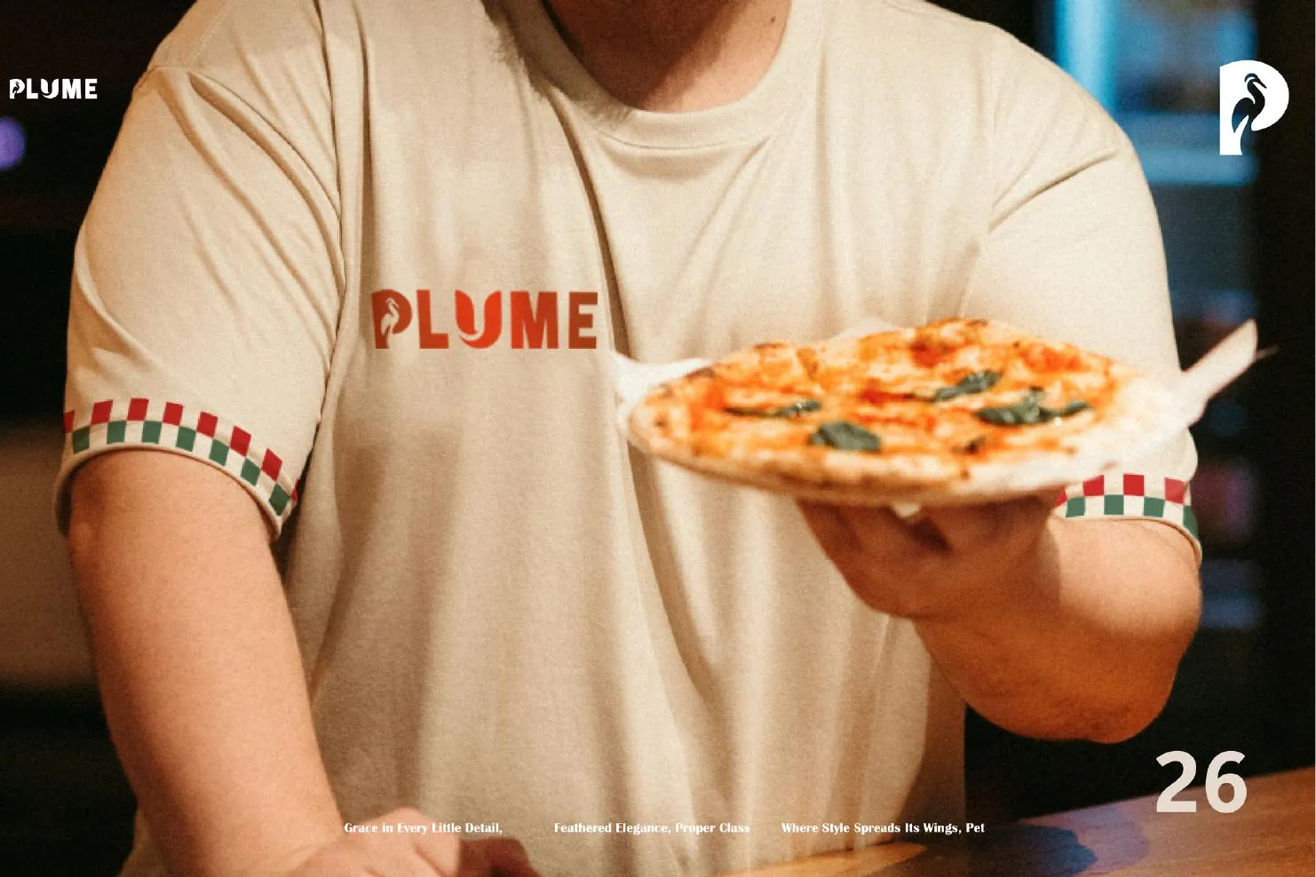
Wordmark and icon with full construction rules, a Pantone-anchored palette, a two-typeface hierarchy, and application across cups, packaging, apparel, lanyards, signage and the café interior.
The system

More from the book
Next project