120plus
A longevity brand built where biotechnology, mythology and human aspiration converge.
- Sector
- Longevity & Wellness
- Services
- Branding, Brand Book, Packaging
- Year
- 2025
“Where science meets soul.”
The brief
A brand about living to 120 — without sounding like either a lab or a temple.
120+ is a future-facing health and wellness brand built at the intersection of biology, mythology and innovation, dedicated to extending human potential in both lifespan and quality of life. The task was a visual identity that could carry a mission that big: empowering people to live fuller, longer, more enriched lives.
The idea
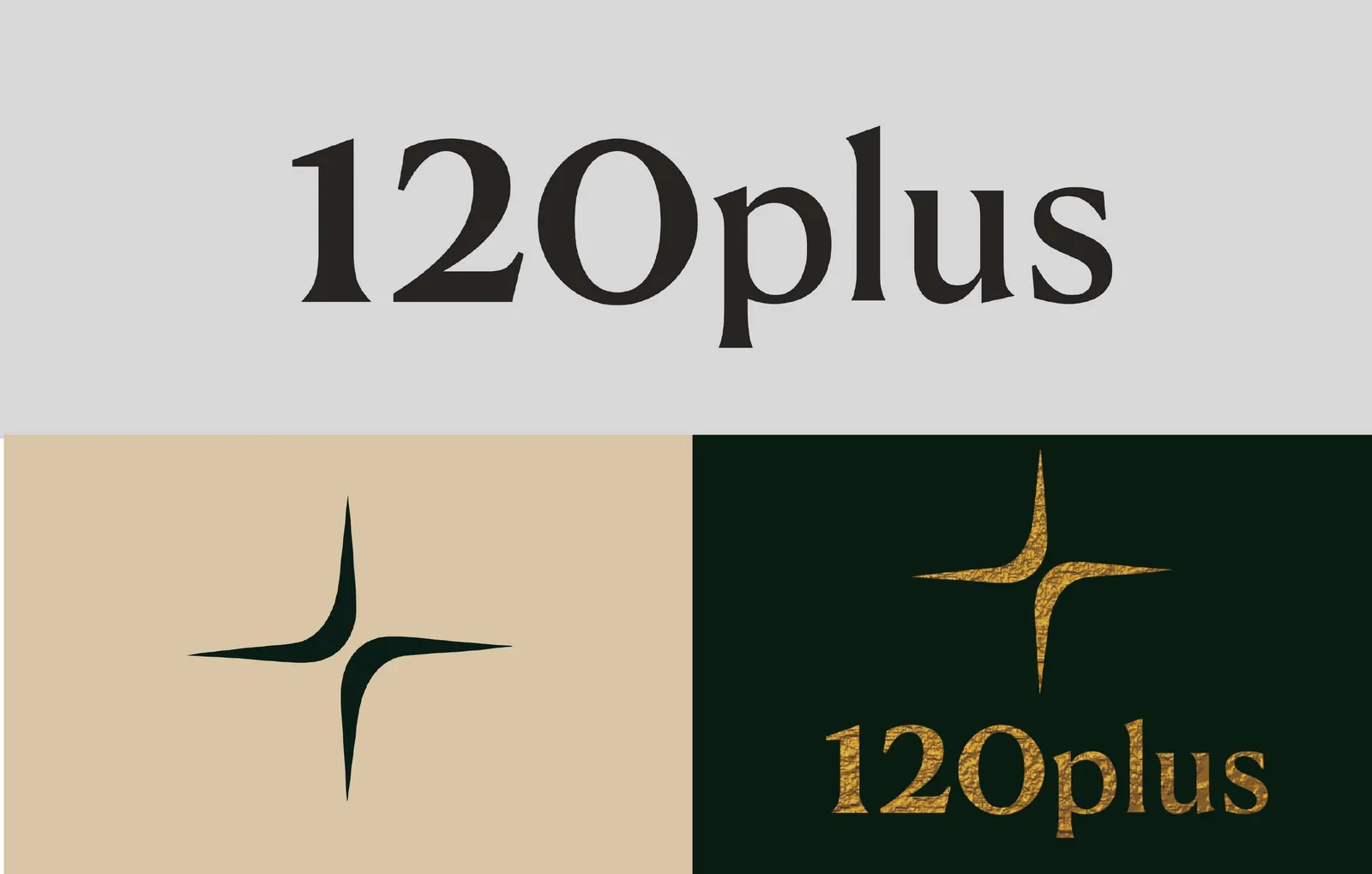
The plus sign as sacred geometry.
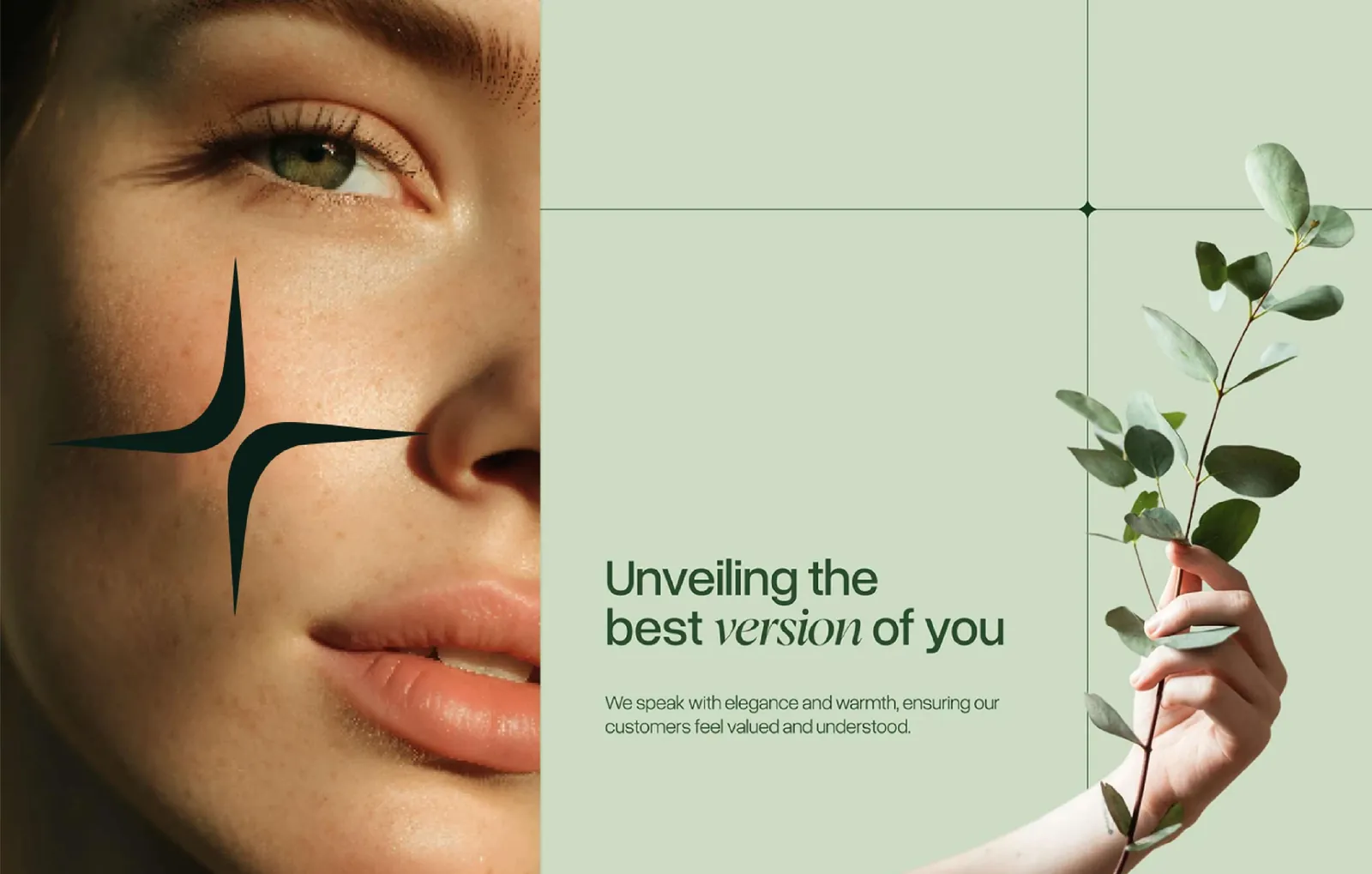
The core challenge was representing something this complex without collapsing into one register. The brand had to feel grounded in science yet spiritually resonant — speaking to the data-driven world of health innovation and to the emotionally-driven human desire for longevity at the same time. The concept draws on sacred geometry and timeless symbols, with the plus sign at the heart of the identity, symbolising life extension, hope and growth.
The outcome
An identity positioned for a category that doesn't exist yet.
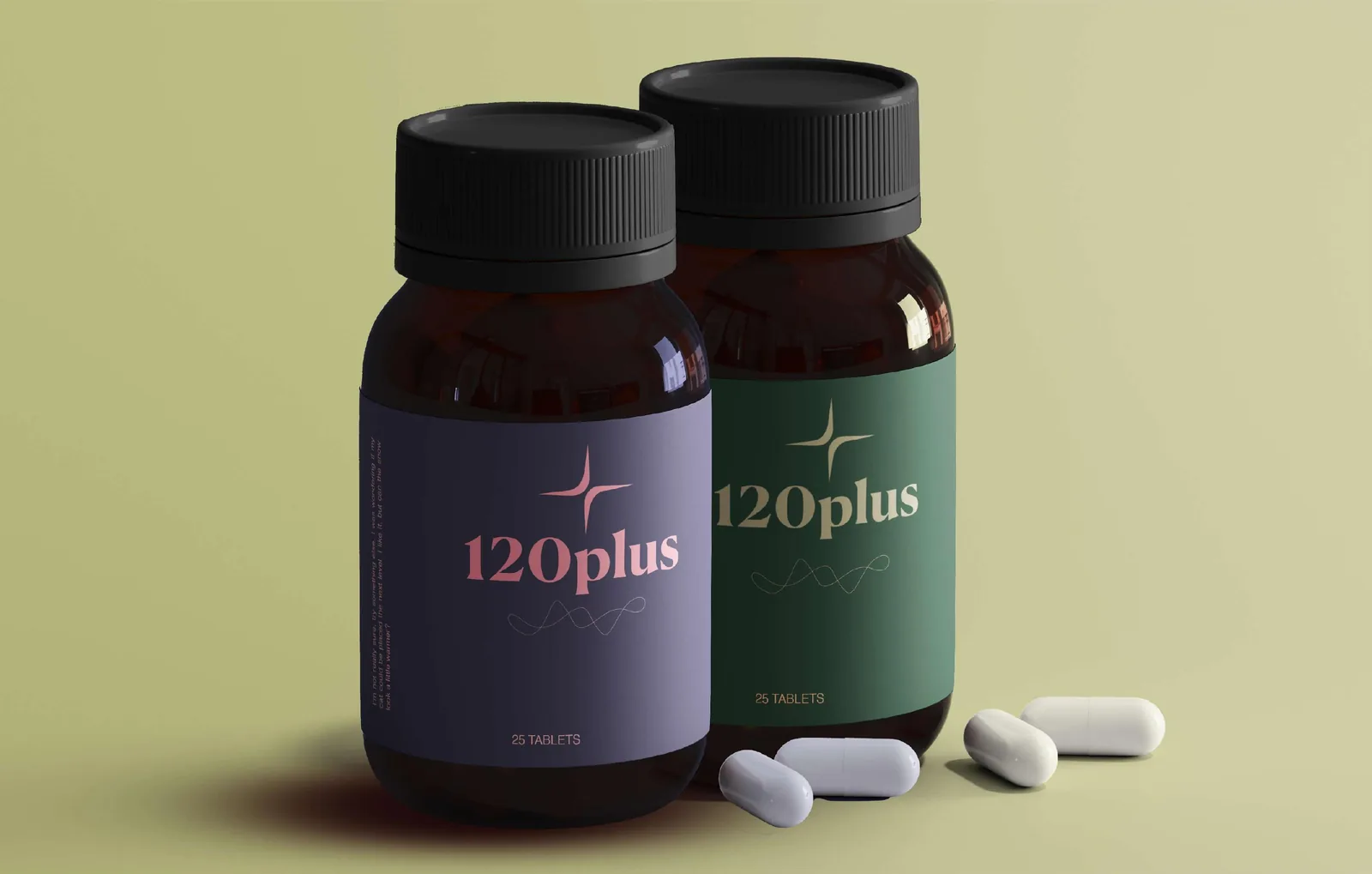
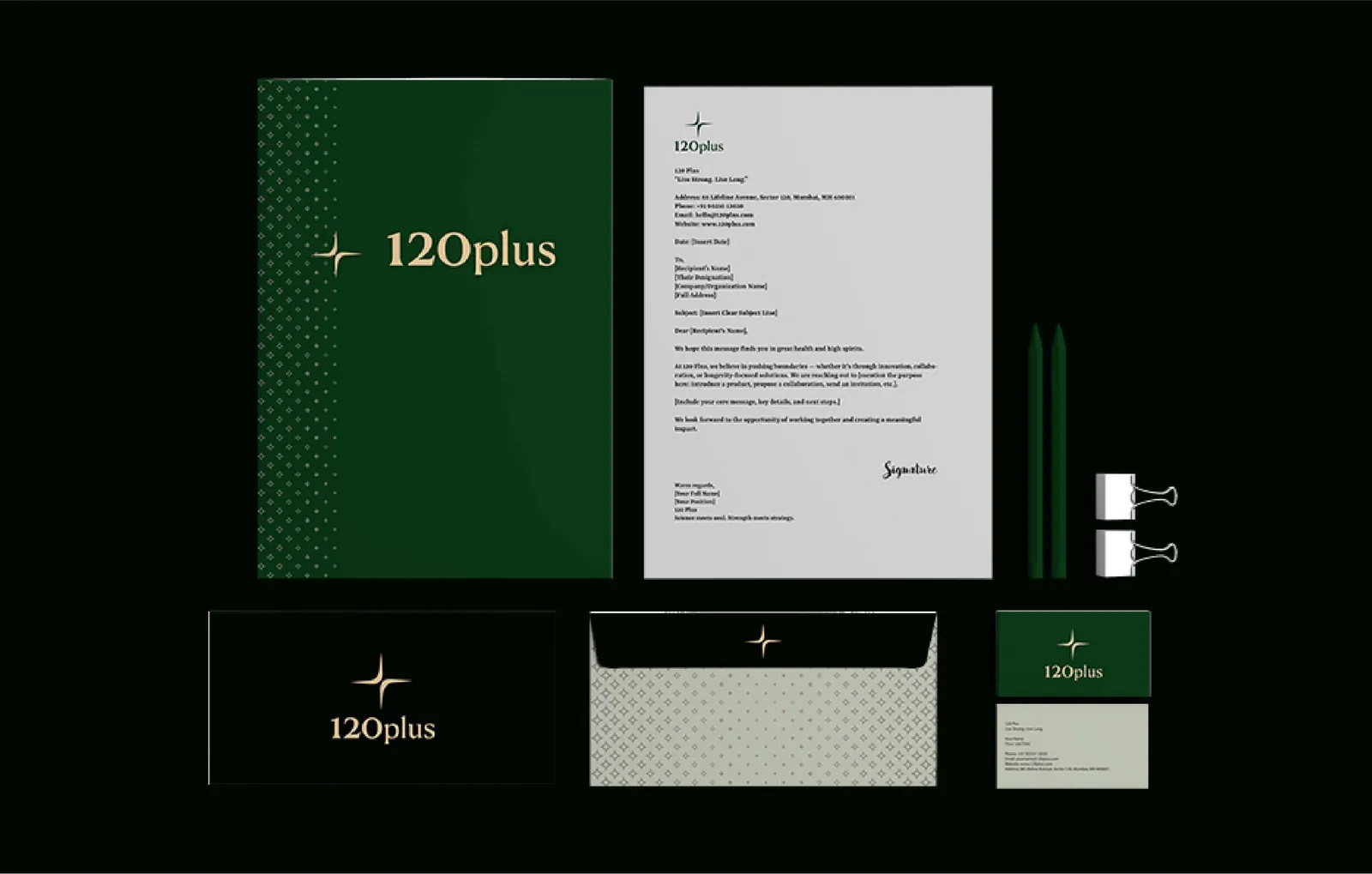
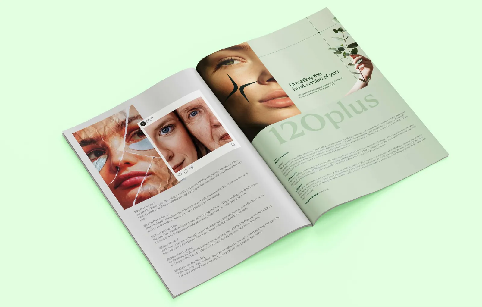
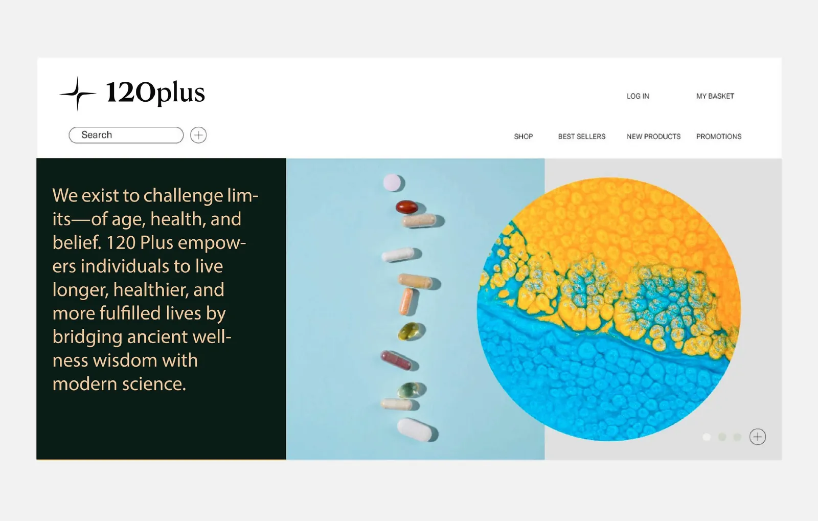
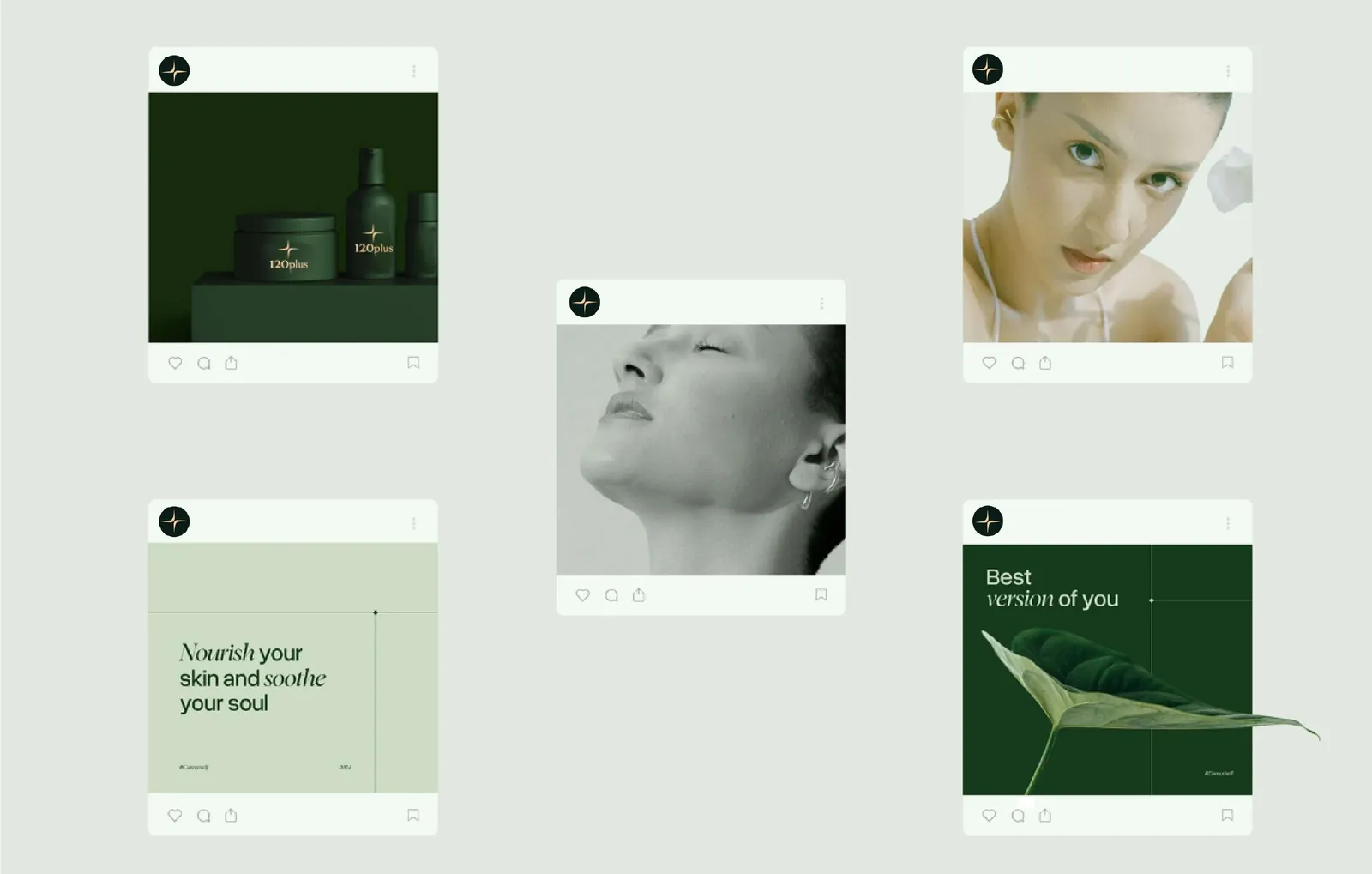
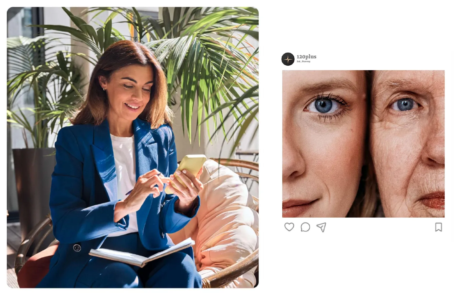
A language merging organic shapes with elemental motifs, applied across supplement packaging, stationery, editorial, e-commerce and social. The result inspires trust, fuels curiosity, and positions 120+ as a visionary leader in the longevity space rather than another supplement label.
The system
Nior Pine
#1A2421
Peach-Orange
#FFA070
Timberwolf
#DBD7D2
Raisin Black
#242124
Midnight Plum
#2E1A32
More from the book
Next project