Oceanic Sushi Roll
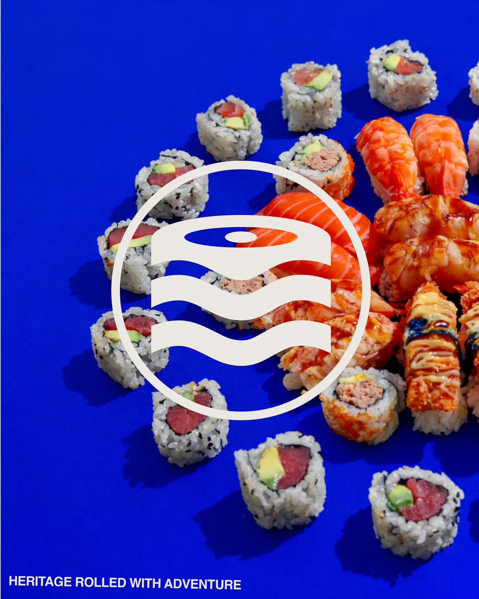
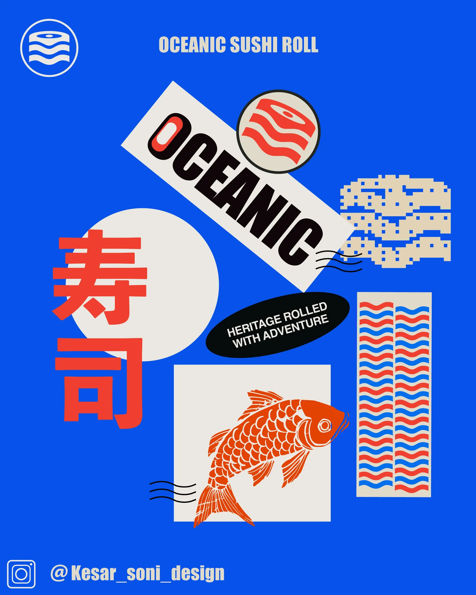
A seal that reads two ways — a slice of salmon, and the sea it came out of.
- Sector
- Japanese Kitchen
- Services
- Branding, Packaging, Art Direction
- Year
- 2025
“Heritage rolled with adventure.”
The brief
Sushi branding is a choice between two clichés.
Japanese food design usually picks one of two lanes: reverent minimalism — beige, brushstrokes, a lot of empty space — or full neon-Tokyo pastiche. Neither fits a kitchen serving bold, modern rolls to people who want the food to look as loud as it tastes. The brief was a third option: rooted in Japanese craft, but with the volume up.
The idea
One mark, two readings.
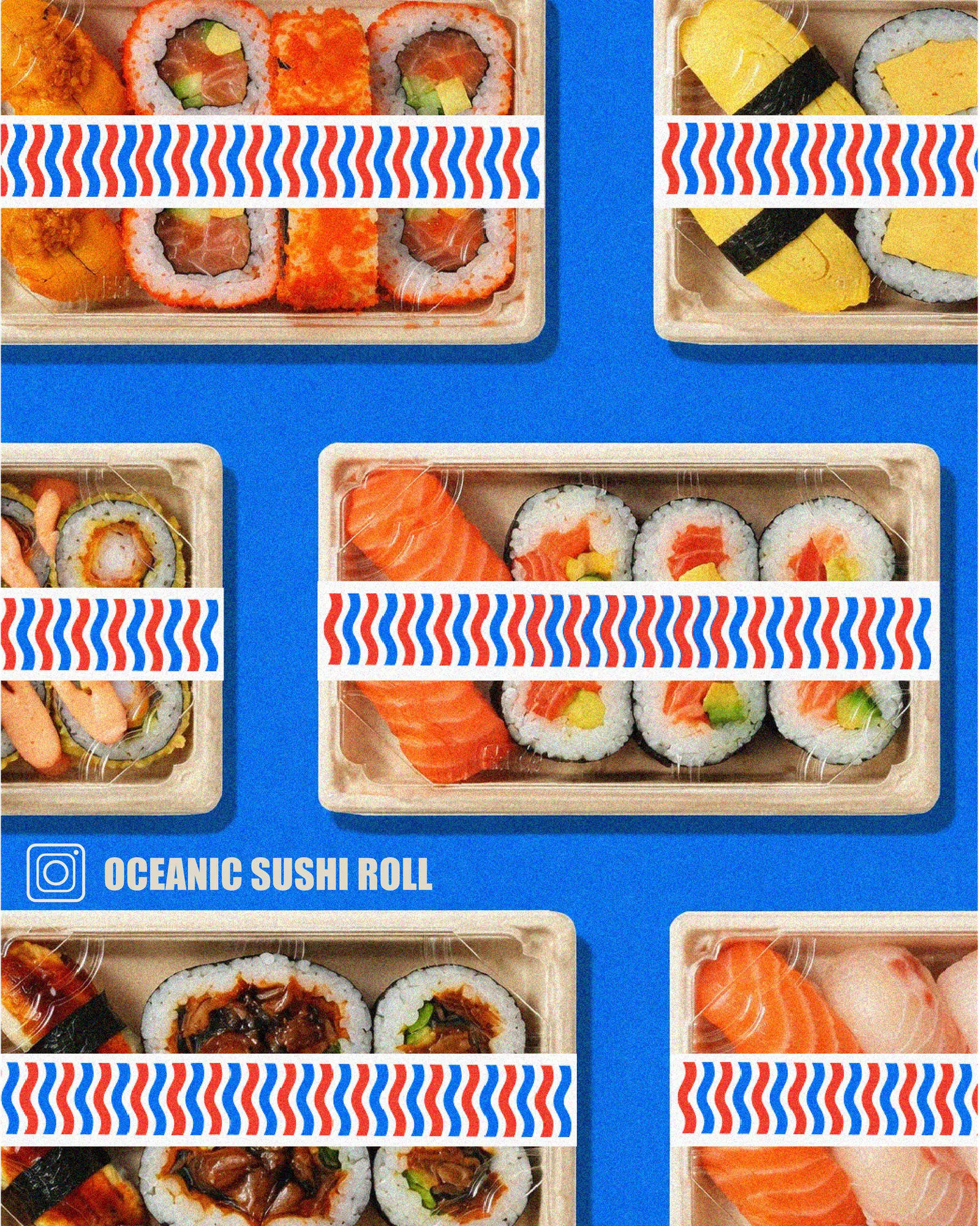
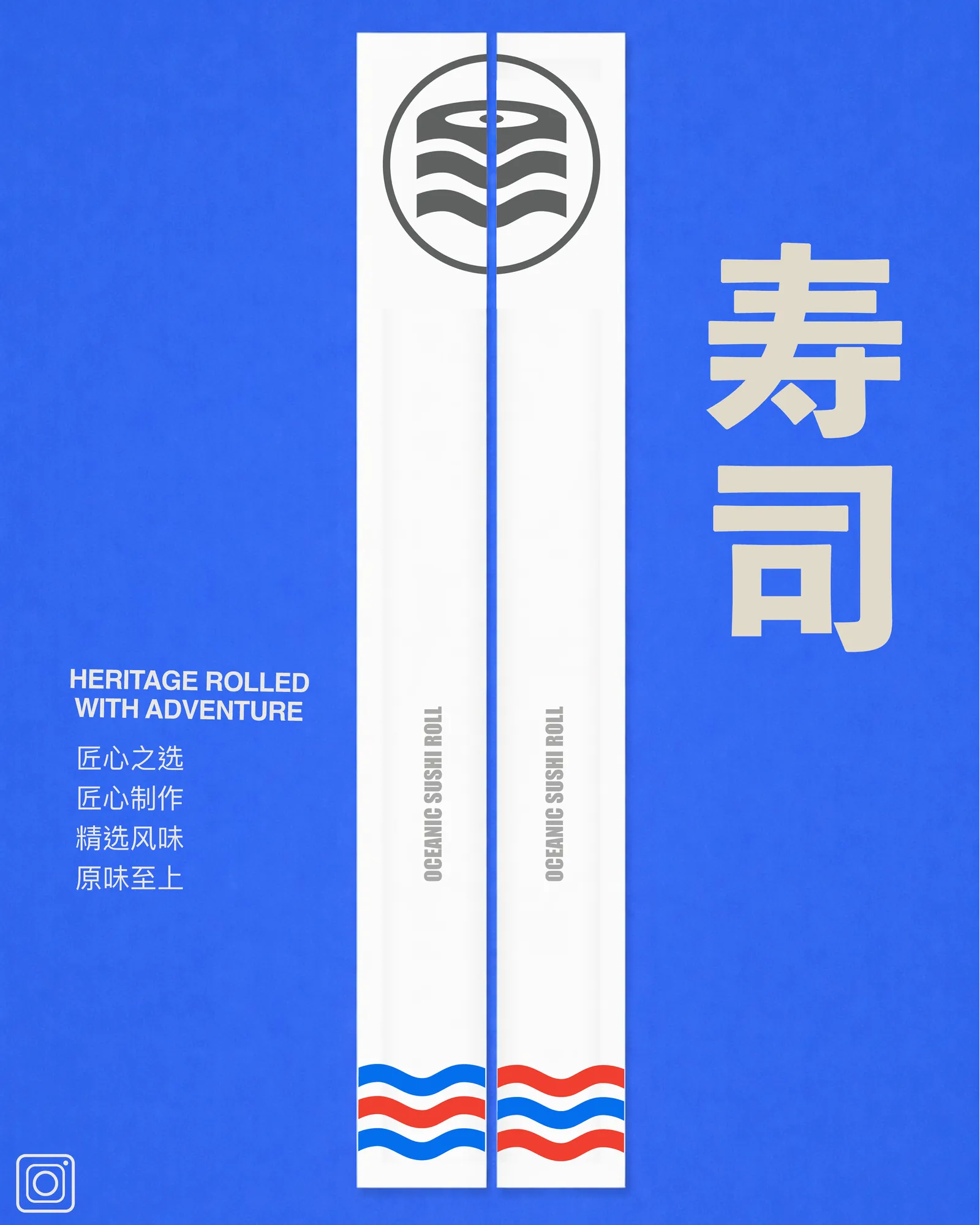
The seal is a circle holding a nigiri slice above three stacked waves. Look at it as food and it's a cross-section of a roll; look at it as landscape and it's the ocean the fish came from. That double reading is the whole identity — heritage in the form, adventure in the colour. The wave motif then becomes a repeating red-and-blue band that runs across every pack, so the system extends without ever repeating the logo.
The outcome
A brand that survives a tray, a billboard and a chopstick sleeve.
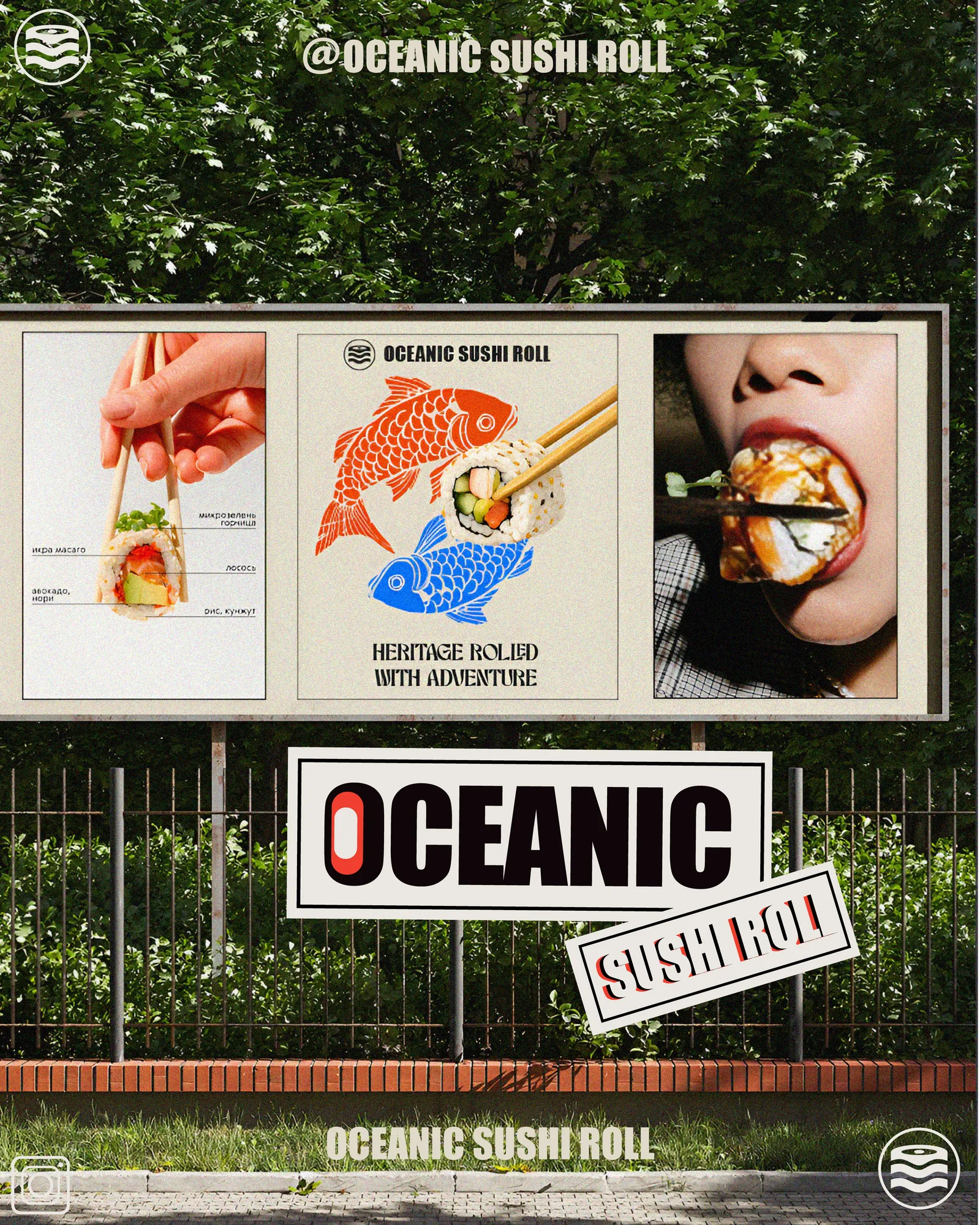
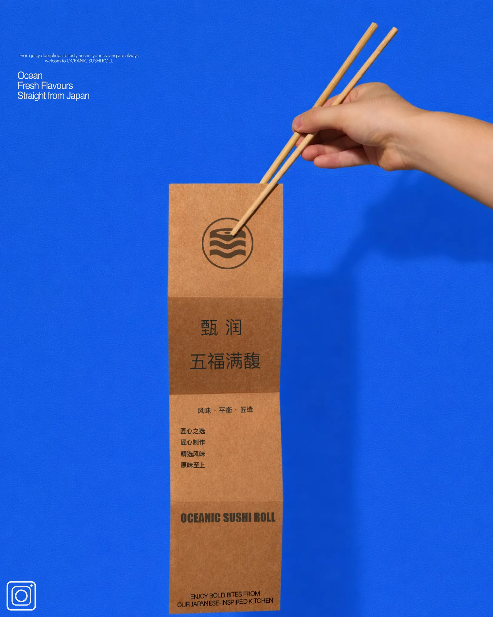
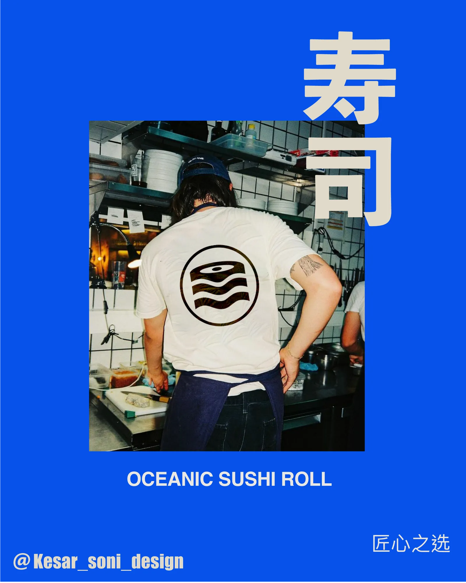
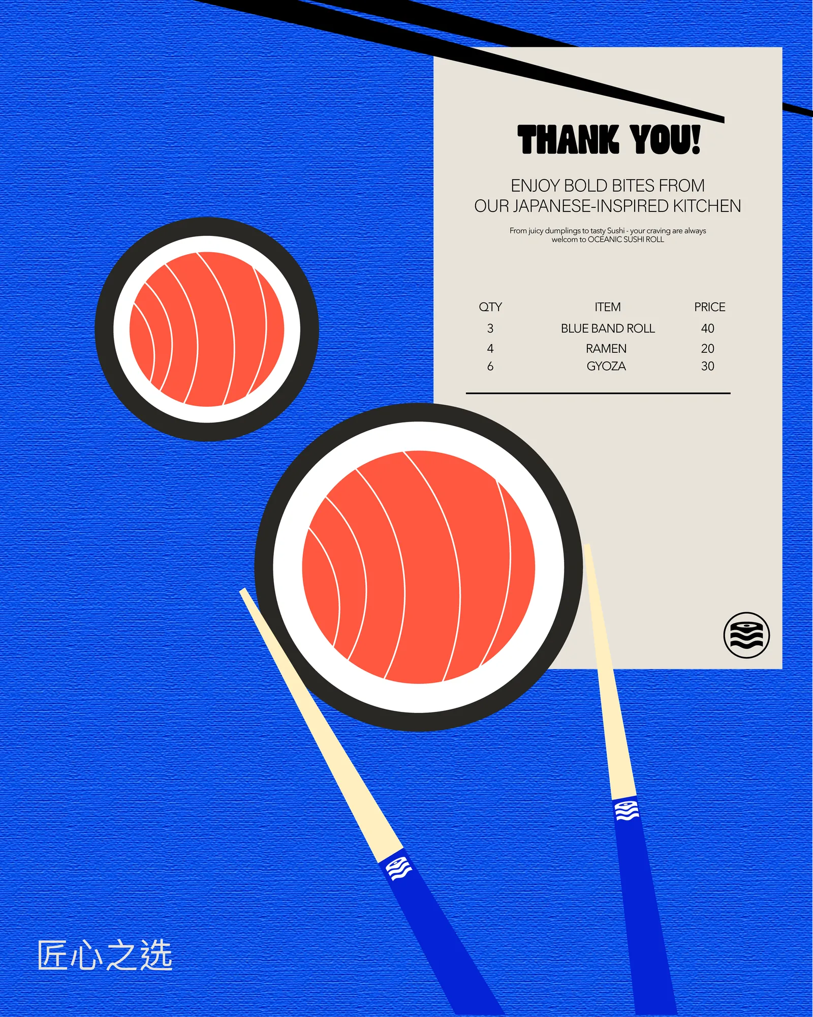
Electric blue against vermilion and cream, applied across takeaway trays with printed wave bands, chopstick sleeves and kraft wrappers, receipts, posters, a billboard, stickers and staff apparel — plus a named product range with the Blue Band Roll leading it. Ocean-fresh flavours, straight from Japan.
The system
Oceanic Blue
#0652EA
Vermilion
#F03828
Rice Cream
#EAE7E1
Nori Black
#080808
More from the book

Next project