- Sector
- Pizza
- Services
- Branding, Brand Book, Packaging
- Year
- 2025
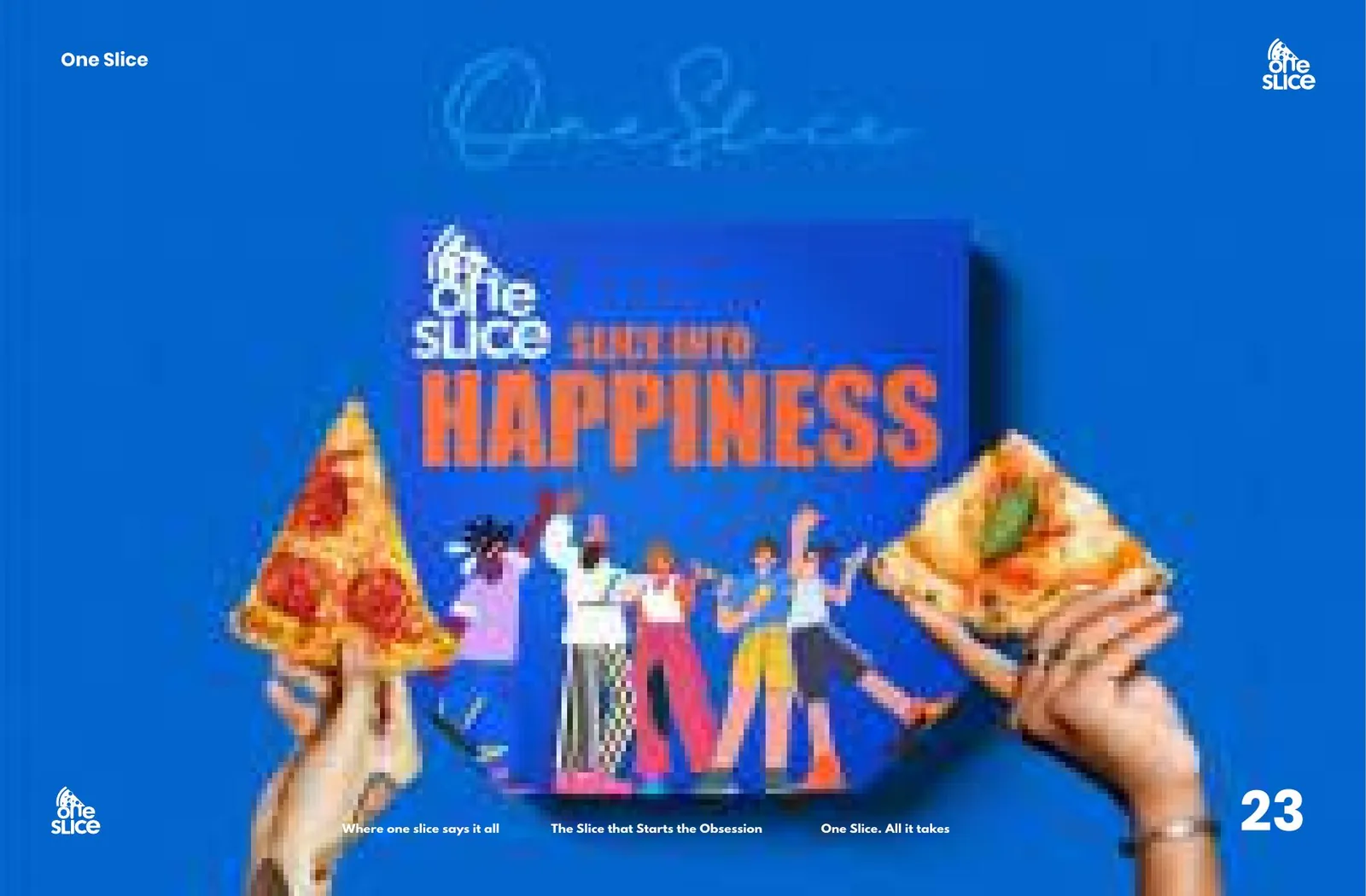
“Slice into happiness.”
The brief
India buys pizza by the box. One Slice sells it by the slice.
The goal was to redefine how India enjoys pizza with a single-slice concept aimed squarely at Gen Z and young adults who want flavour, convenience and a vibe — slices generously sized to satisfy, never skimpy. That's a format change as much as a brand, so the identity had to make the format feel deliberate rather than cheap.
The idea
Build the mark out of the product itself.
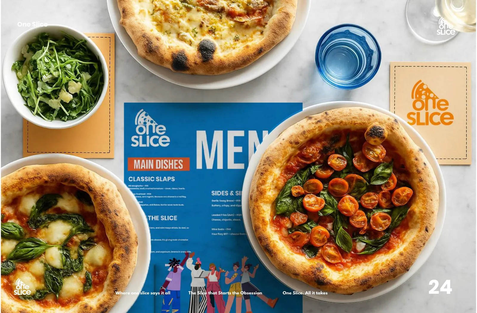
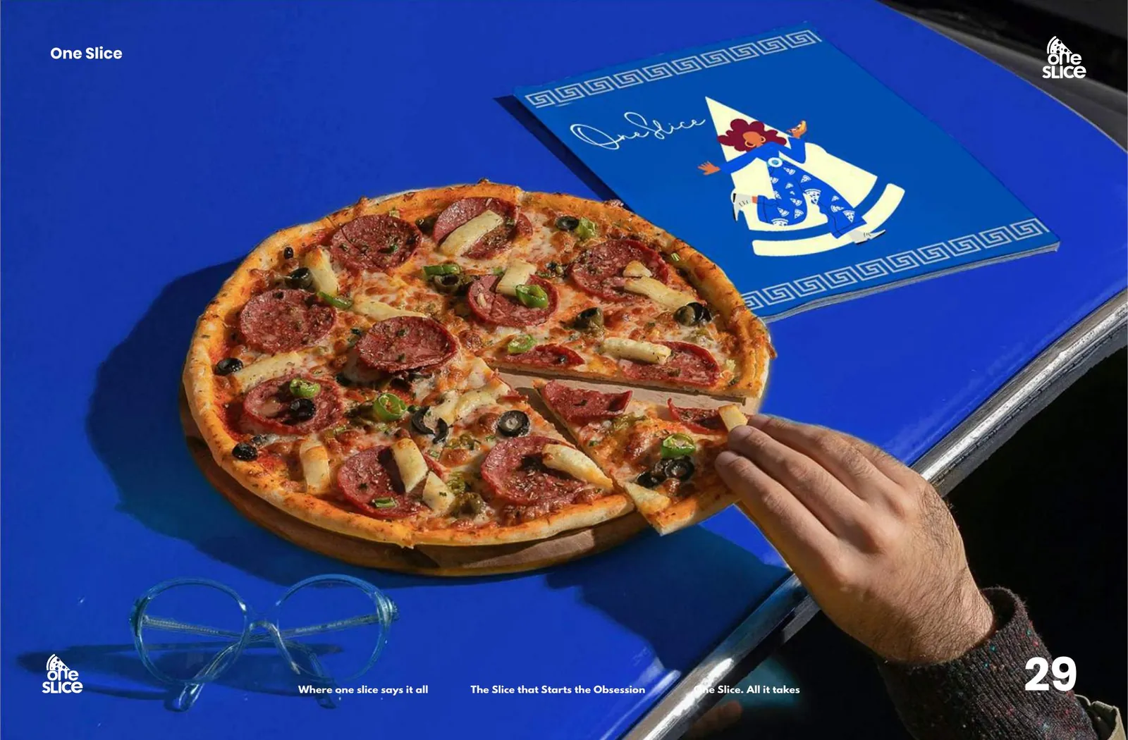
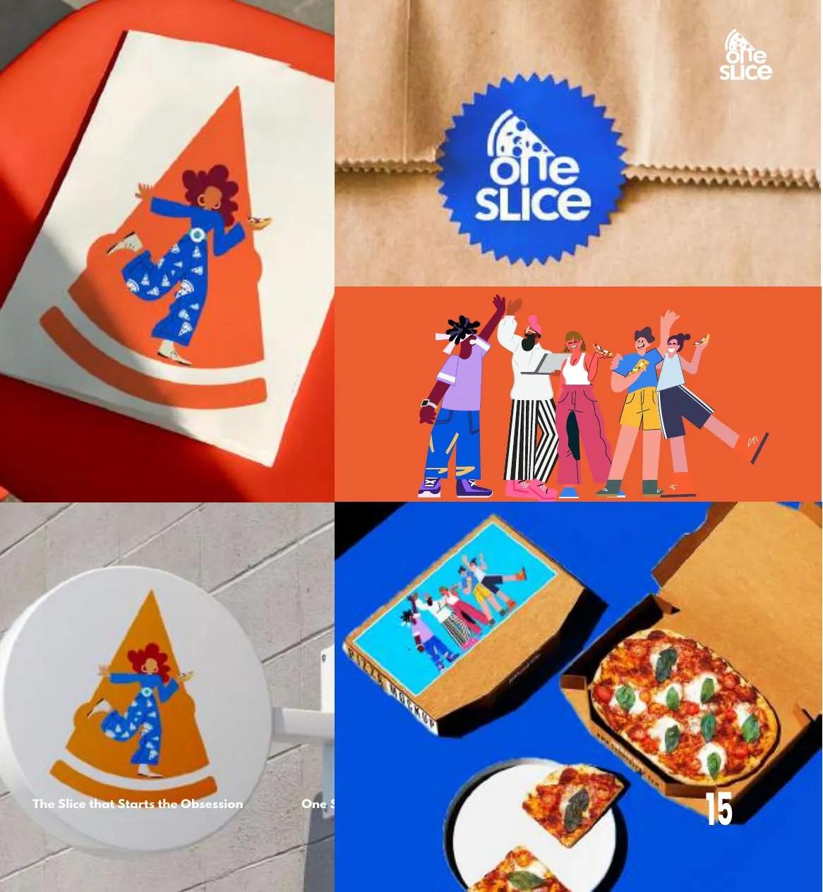
The logo is a single slice, drawn as a stylised base, crust and toppings, with the O of One doubling as the pizza. Electric blue against coral orange keeps it loud in a category drowning in red-and-green cliché — and a cast of illustrated characters gives the brand somewhere to be joyful without touching the mark.
The outcome
A system that survives a counter, a box and a phone.
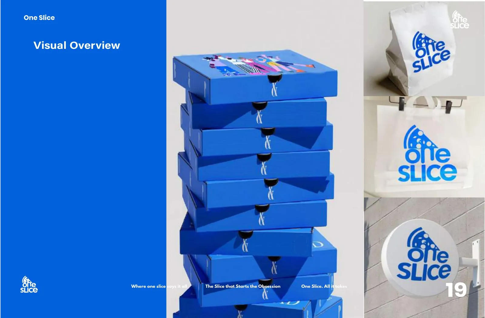
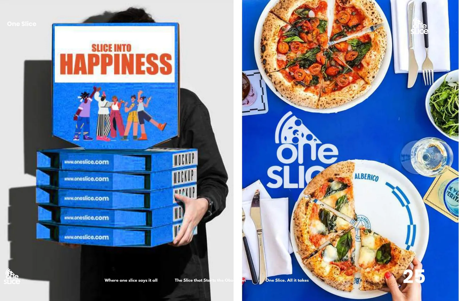
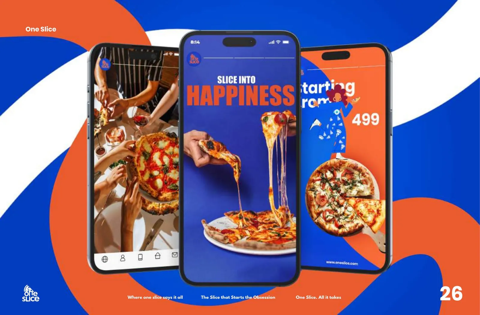
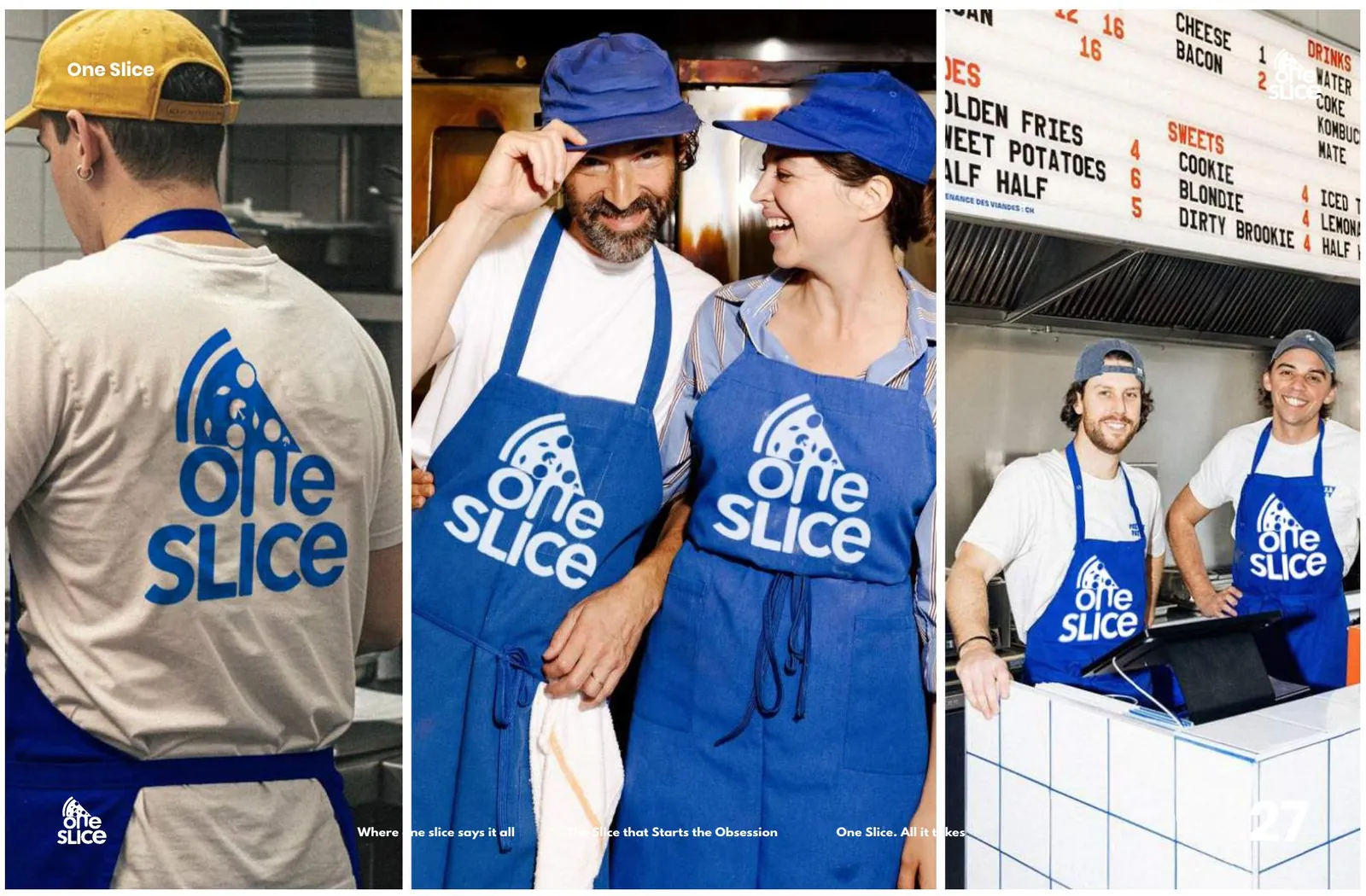
Full identity and brand book, an illustration library, boxes and tote packaging, uniforms, in-store menu boards, out-of-home and an app UI — three very different battles for the same mark, all fought with one system.
The system
Bleu Azure
#0061DC
Outrageous Orange
#FF6B3C
Name White
#FFFFFF
More from the book

Next project