Hot N Juicy Crawfish
A Cajun seafood institution since 2007, rebuilt around one idea: replace a claw with a flame.
- Sector
- Cajun Seafood
- Services
- Branding, Brand Book, Packaging
- Year
- 2025
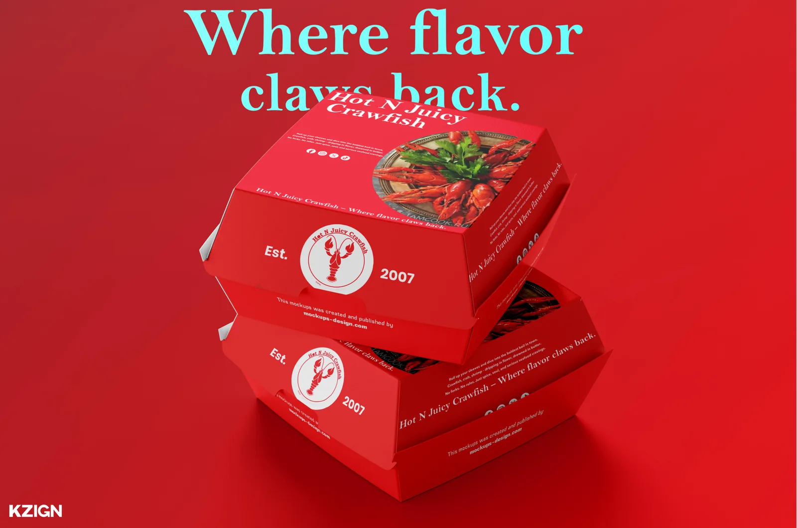
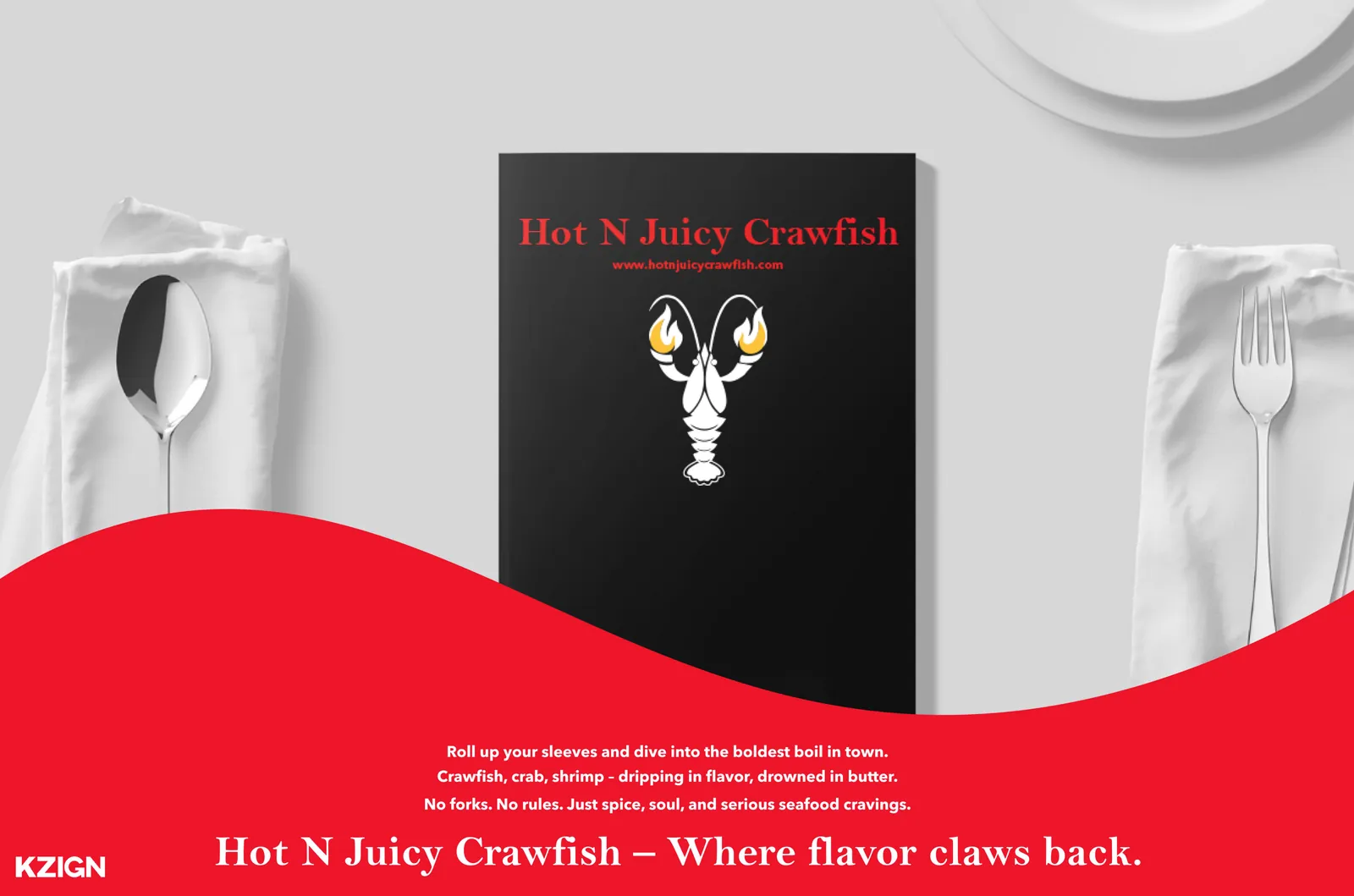
“Where flavor claws back.”
The brief
A legacy worth keeping, wearing a brand that had stopped keeping up.
Hot N Juicy Crawfish has been running since 2007, and it isn't really a restaurant — it's a ritual. Gloves, bibs, a table covered in shells, and everybody's hands a mess. The food had that reputation already. The identity didn't carry any of it, and none of the touchpoints agreed with each other: menus, signage, packaging and social were all speaking differently.
The idea
Put the heat in the mark itself.
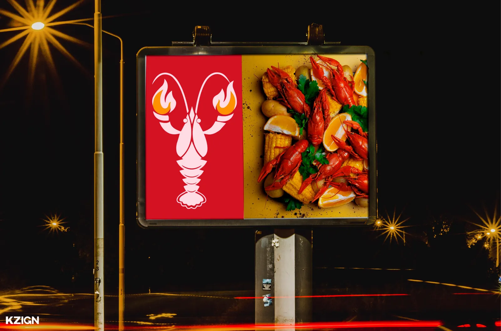
The crawfish is the heart of the cuisine, so it stays — authentic, Southern, unmistakable. But one claw becomes a flame. That single substitution does the work a tagline usually has to: it signals heat, spice and bold flavour before anyone reads a word, and it makes the mark legible at bottle-cap size and on a billboard alike.
The outcome
One system, applied everywhere the brand actually shows up.
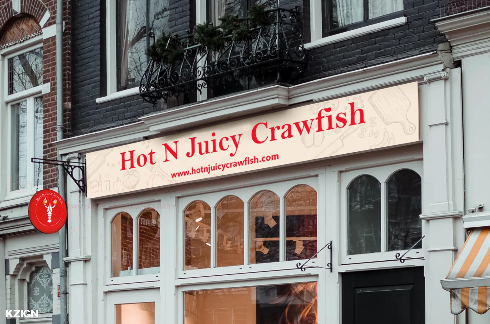
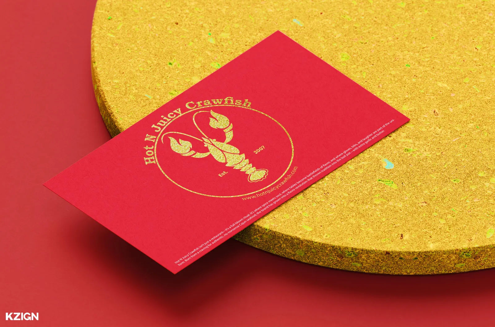
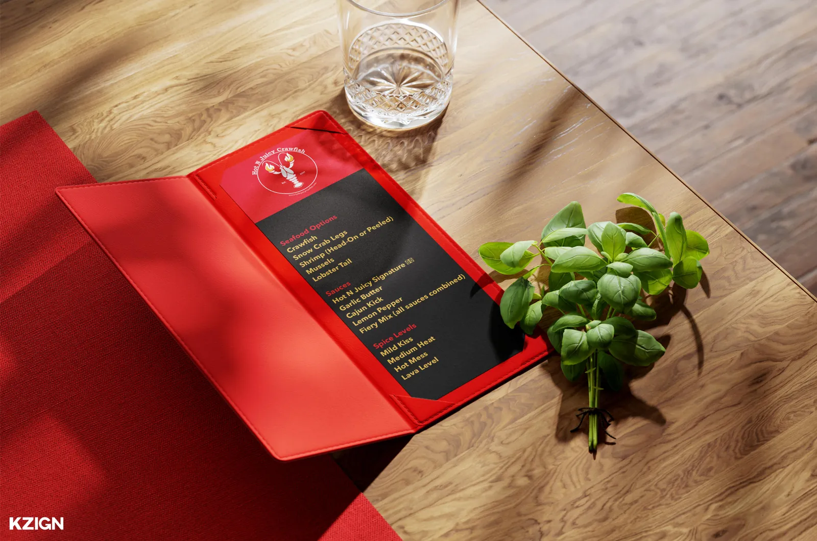
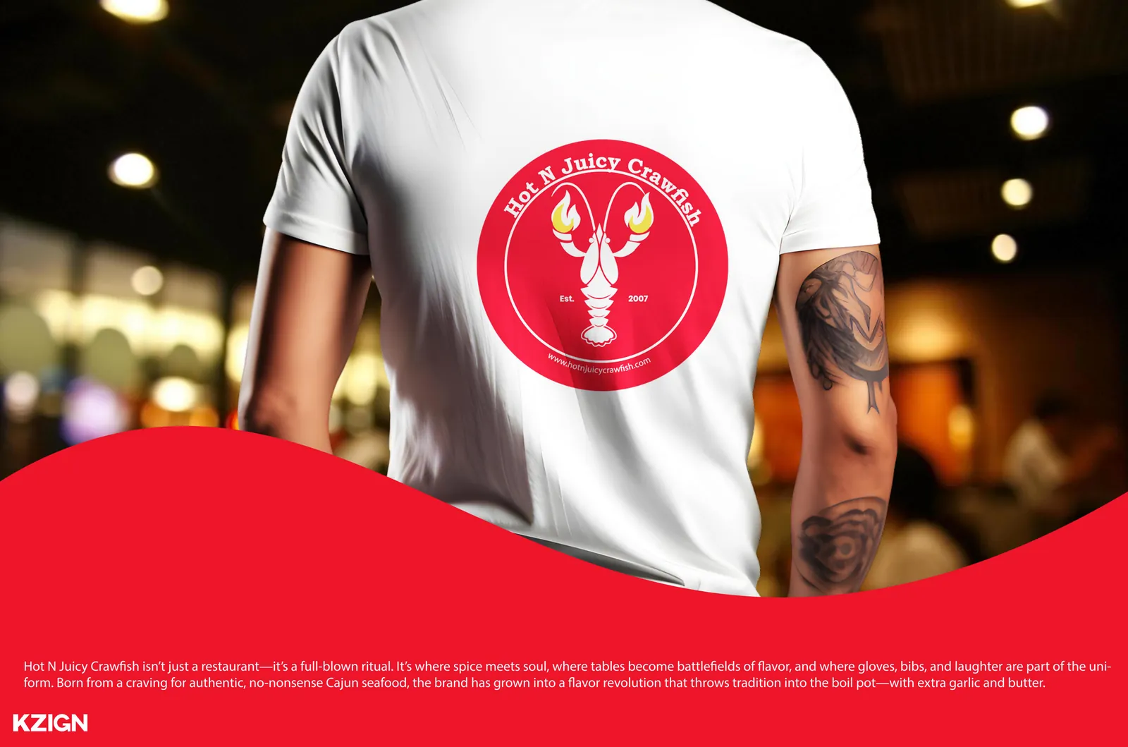
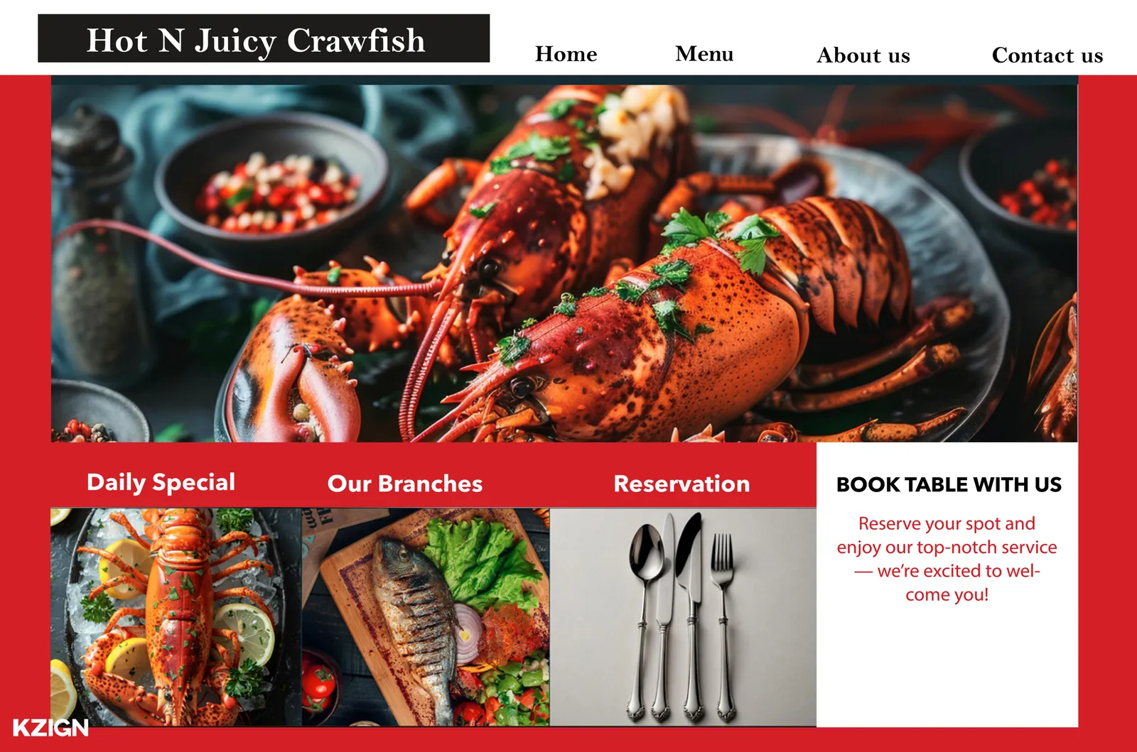
The refreshed black, red and yellow palette carried across menus, storefront signage, packaging, business cards, apparel, billboard and a website design — with a verbal identity to match. Positioned as a cult favourite for foodies and young professionals: the legacy amplified rather than replaced.
The system
Crimson Red
#EE152A
Scarlet
#E83624
Sunray
#EC8C51
Charcoal Blue
#1A2126
White
#FFFFFF
More from the book
Next project