Matchitas
Ceremonial matcha relocated to a tropical-botanical world, for people who drink it as a pause.
- Sector
- Matcha
- Services
- Branding, Brand Book, Packaging
- Year
- 2025
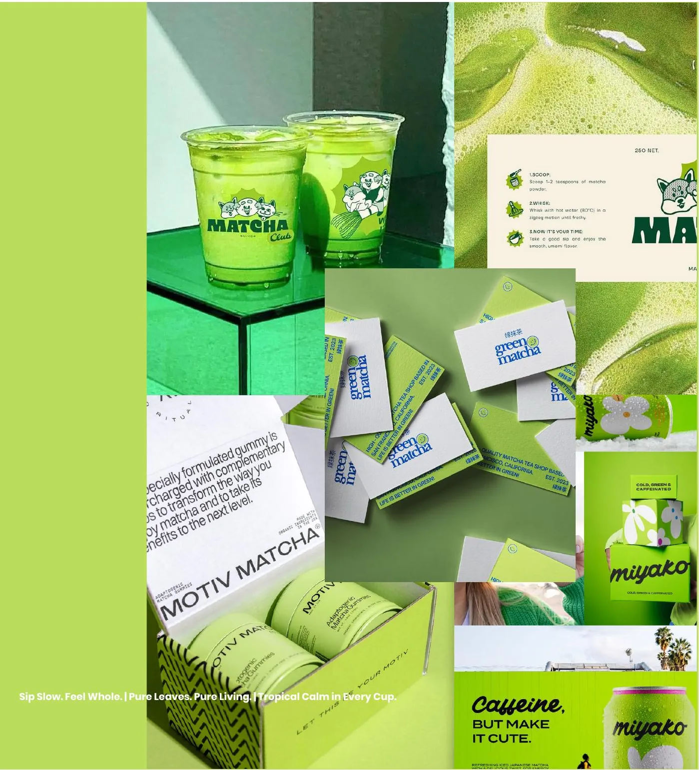
“Sip slow. Feel whole.”
The brief
Matcha without the monastery, and without the sugar.
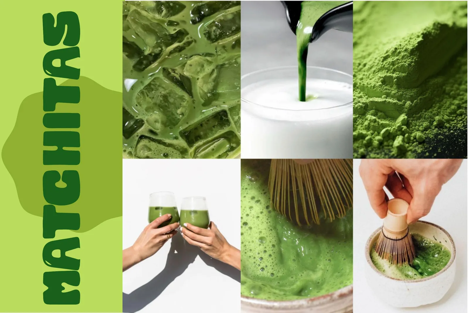
Matchitas is a modern, health-forward matcha experience rooted in clean, high-quality ingredients with no artificial additives. The brief was a brand that could feel modern, earthy and refreshingly tropical at once — speaking to mindful millennials and Gen Z who value wellness, nature and aesthetics in equal measure.
The idea
Hide the whisk inside the letter.
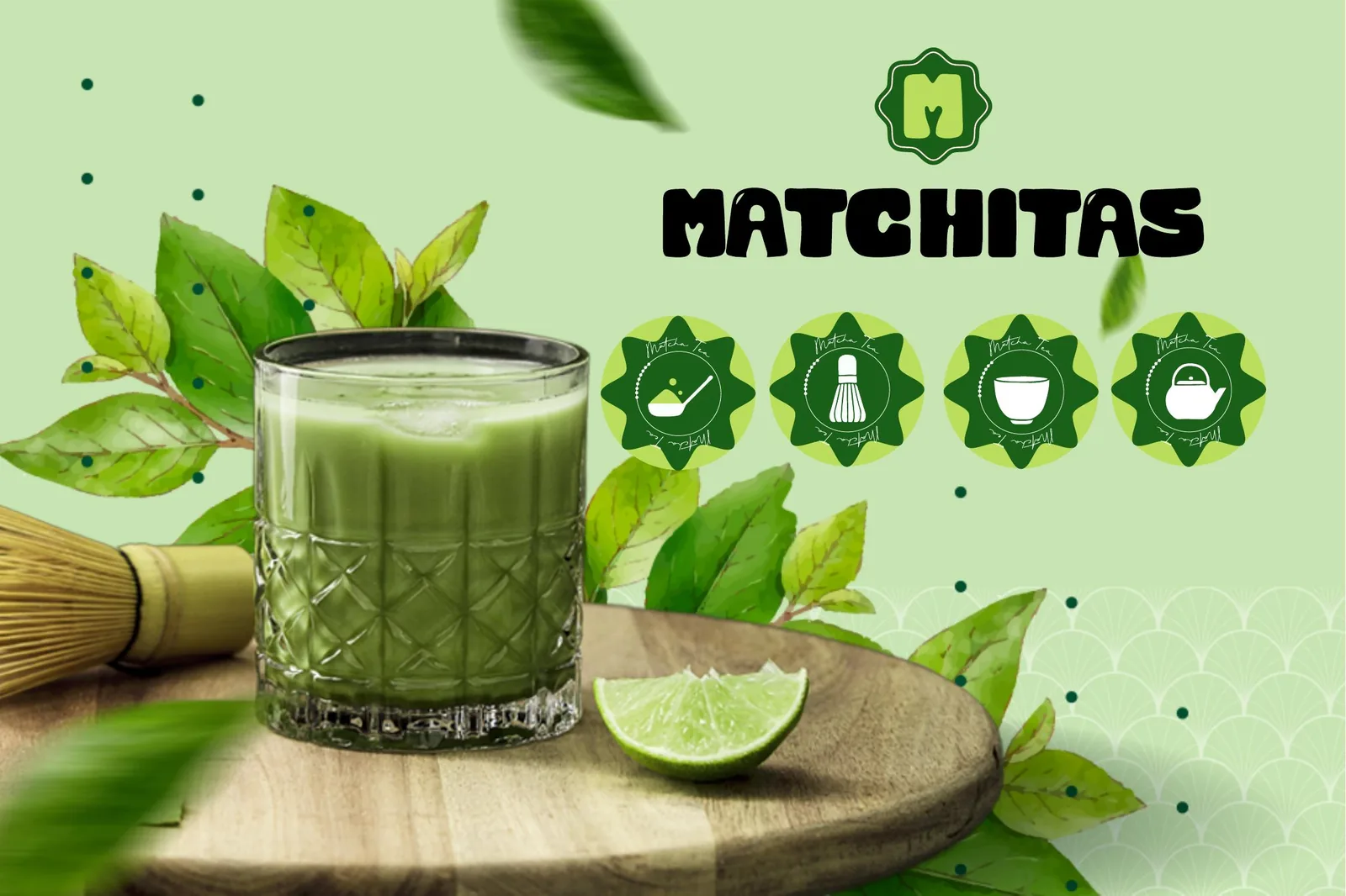
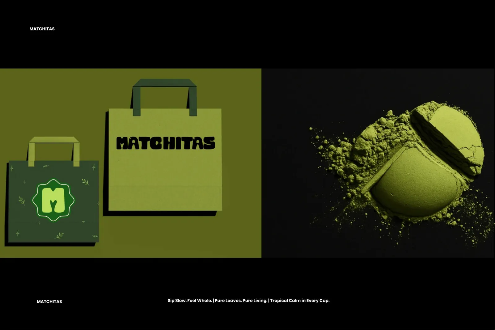
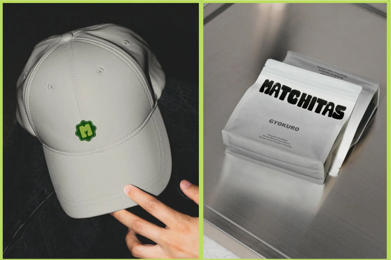
The M in the logomark is cut with negative space shaped from the traditional bamboo chasen — a detail that grounds the wordmark in real craft rather than borrowed Japanese decoration, and gives the brand a badge that works as a rosette seal on a pouch, a cup or a cap. An icon family of whisk, kettle, cup and bowl extends it without repeating it.
The outcome
A grounding moment, made into a shelf presence.
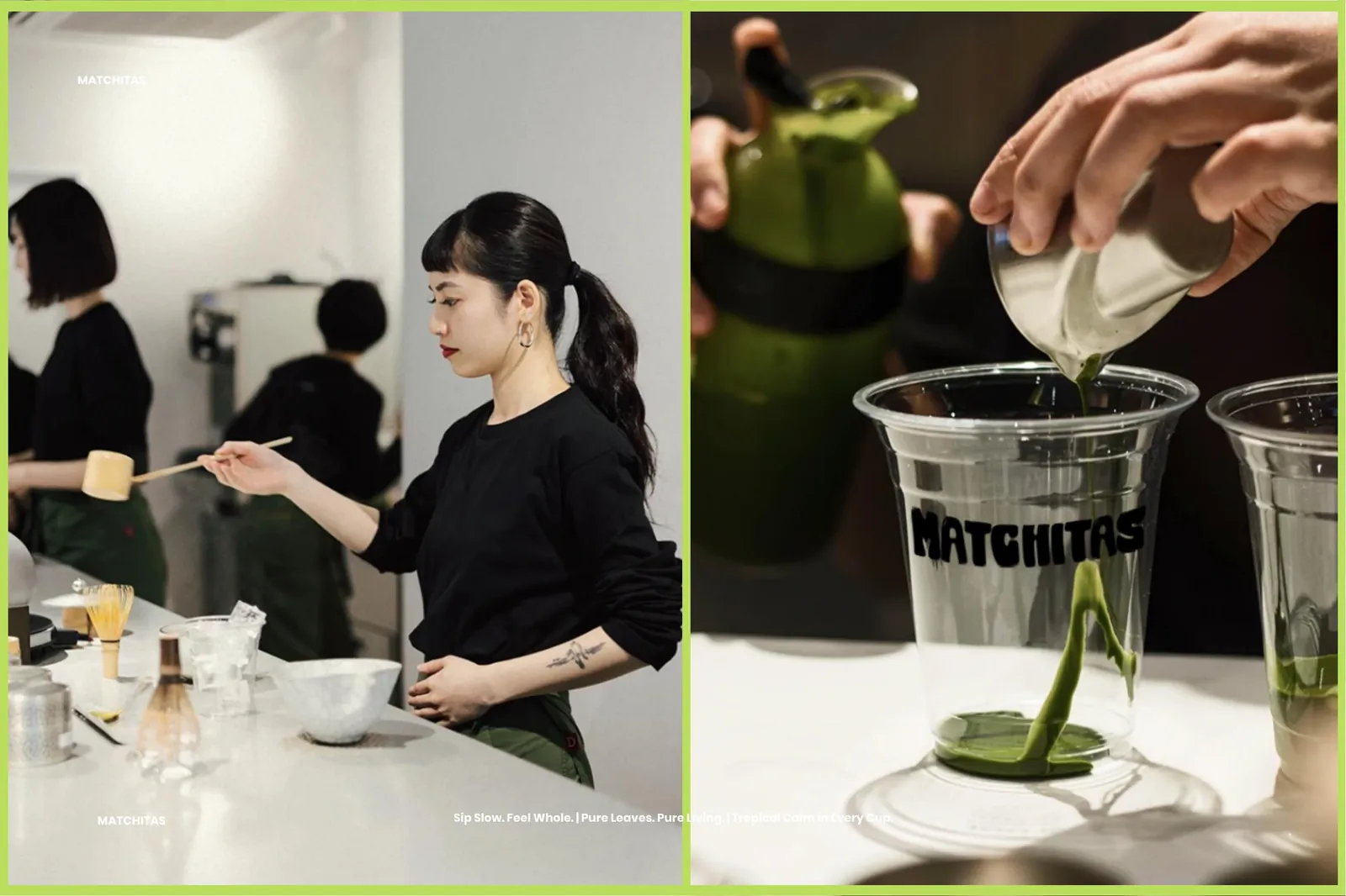
Wordmark, rosette logomark and icon set, a five-colour palette built on matcha green and tropical blush, packaging across pouches and cups, apparel, tote and café application — a space for health-conscious people to pause, sip with intention, and get on with the day.
The system
Matcha Light
#BADE5B
Deep Leaf
#19611A
Blush
#FEE4E2
Turmeric
#F5BE35
White
#FFFFFF
More from the book
Next project