
Uncommon Ice Cream
Boston artisan ice cream with New England restraint — a cartouche, not a cartoon.
- Sector
- Ice Cream
- Services
- Branding, Brand Book, Packaging
- Year
- 2025
“Craftsmanship, nostalgia, community.”
The brief
Artisan quality that looked like everything else in the freezer.
Uncommon Ice Cream set out to blend artisanal quality with nostalgic charm, aiming to become a local favourite in its historic Boston neighbourhood with flavours that surprise and delight — and needed a visual identity that resonated with modern consumers without abandoning that heritage.
The idea
Borrow New England's timeless aesthetic, not the ice cream aisle's.
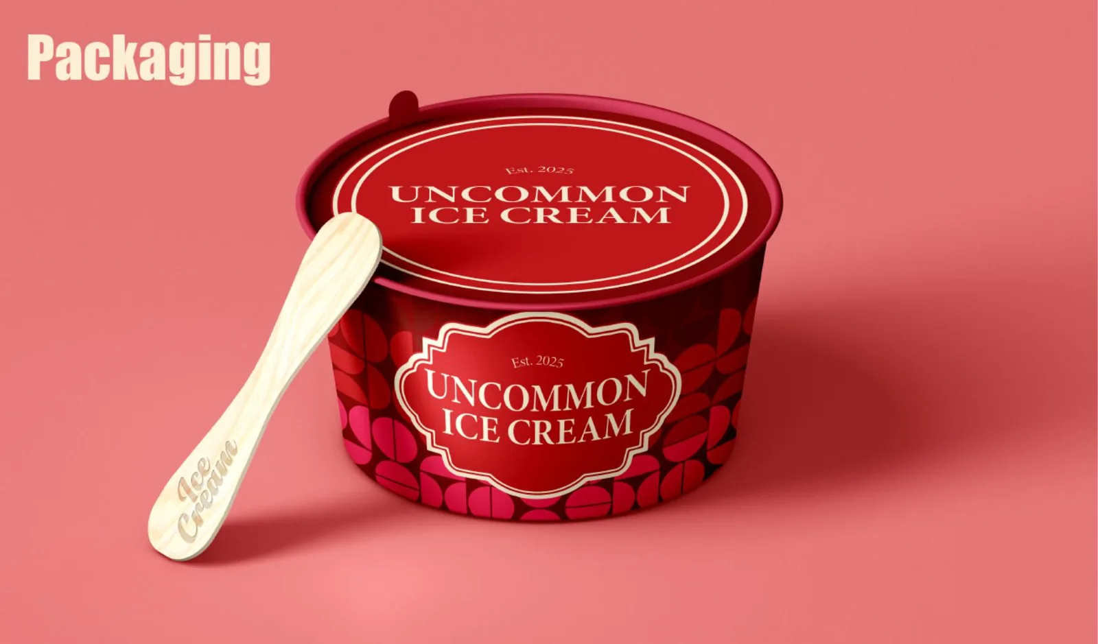
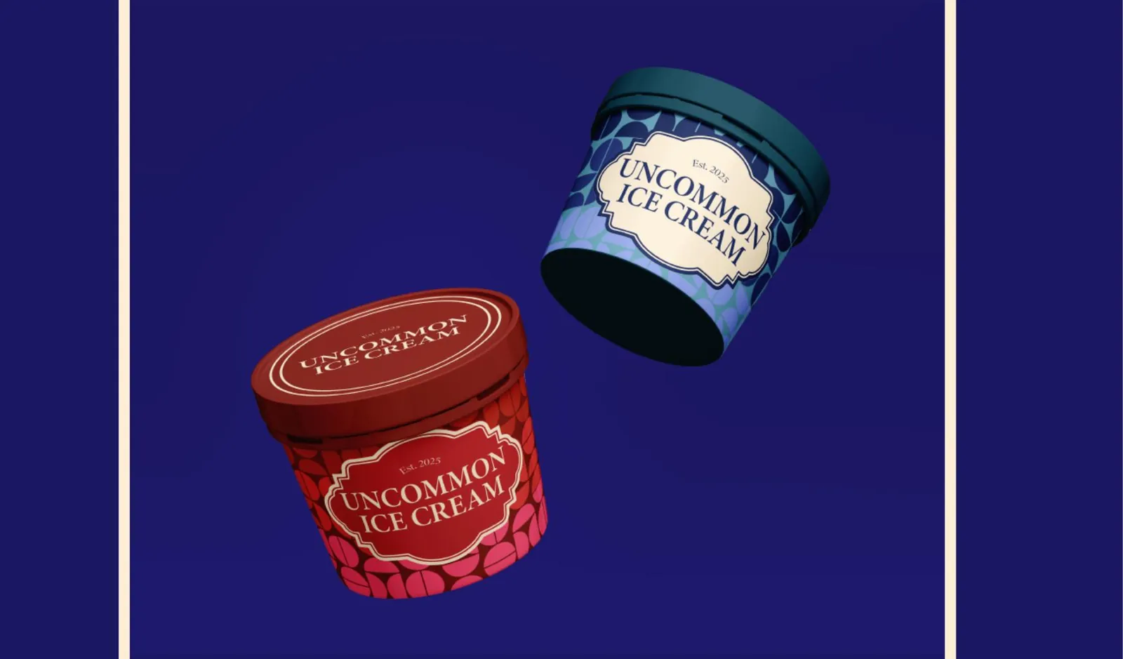
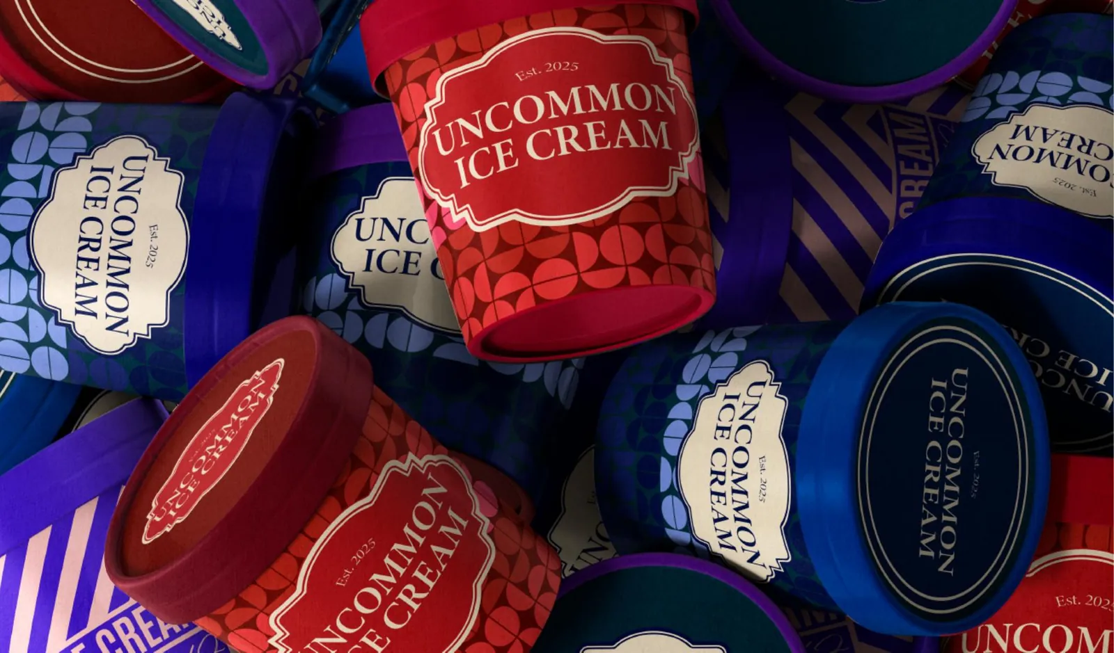
Instead of the bright, rounded, childlike conventions of the category, the identity takes its cues from New England's timeless aesthetic: a refined serif wordmark set inside an ornamental cartouche, restrained colour, and a geometric pattern system that does the playfulness so the logo doesn't have to. Elegance, warmth and originality — aimed at families, professionals and food enthusiasts alike.
The outcome
A pint that looks like it's been there for decades.
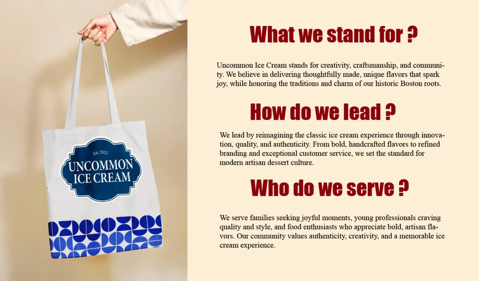
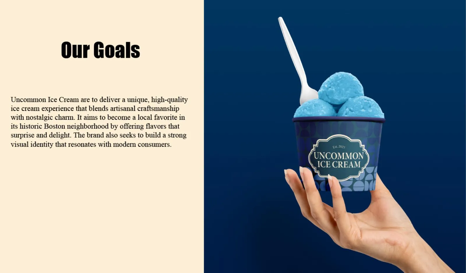
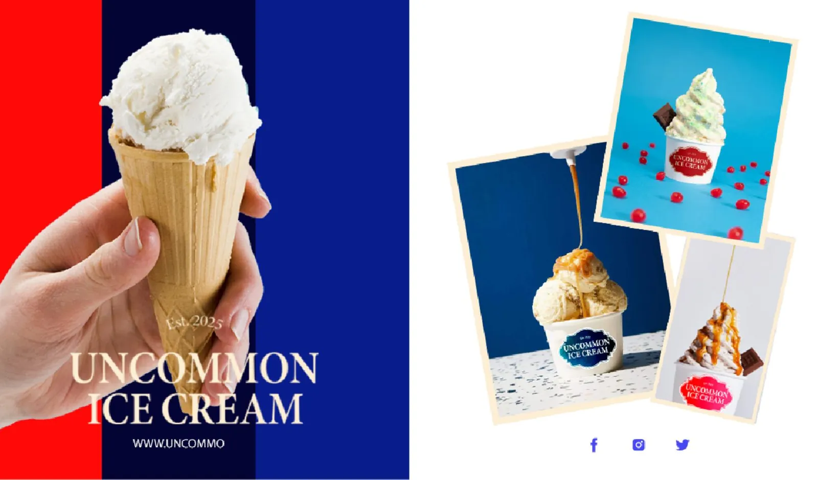
Wordmark and seal, a deep teal, red and coral palette, a modular pattern system, and packaging across pints, tubs and cones — plus tote and social application.
The system


More from the book

Next project