Always Tired
A sparkling reset for the overstimulated — adaptogens, electrolytes, and no wellness sermon.
- Sector
- Functional Beverage
- Services
- Branding, Brand Book, Packaging
- Year
- 2025
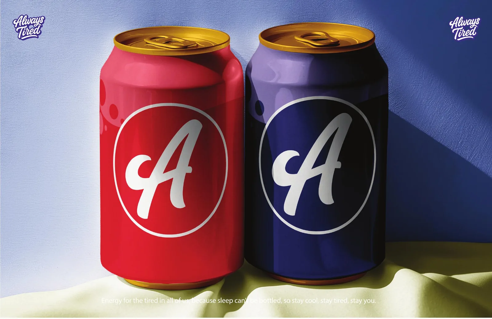
“Sleep can't be bottled. Stay cool, stay tired, stay you.”
The brief
A functional drink for people who are done being told to optimise.
Always Tired is built for the pace everyone is actually living at — too many screens, too much stress, never enough balance. It blends adaptogens, electrolytes and real flavour into a sparkling reset. The positioning had to hold one line honestly: tired doesn't mean broken.
The idea
Name the feeling instead of denying it.
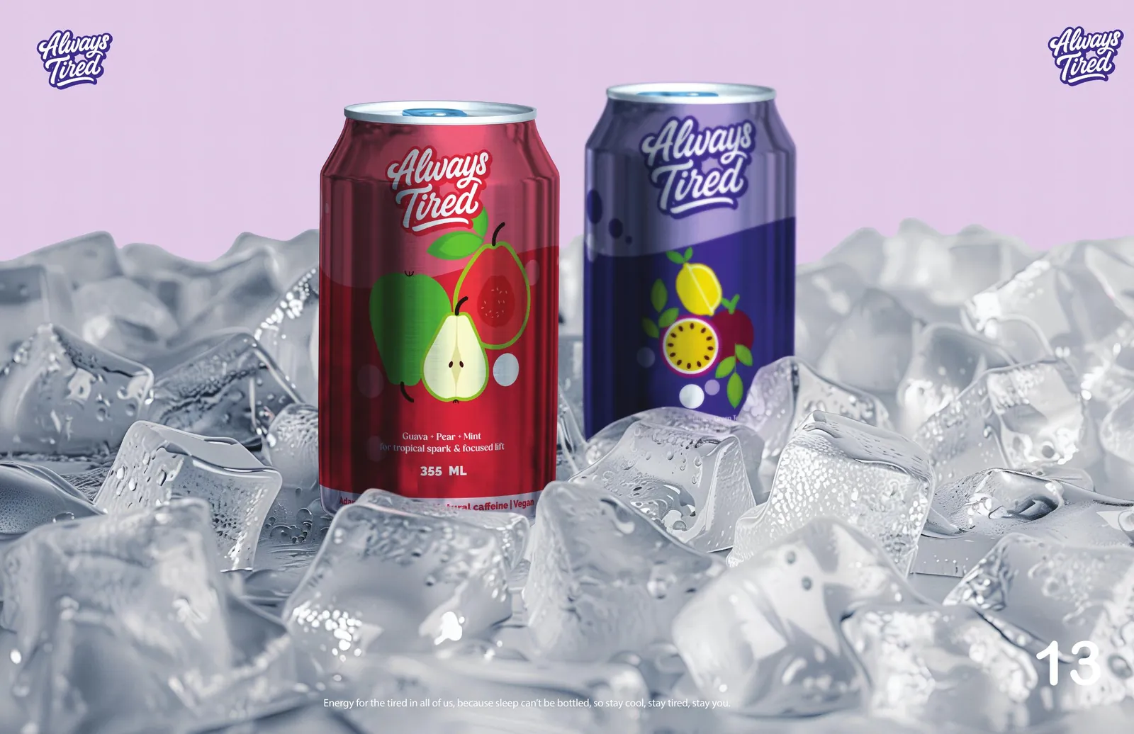
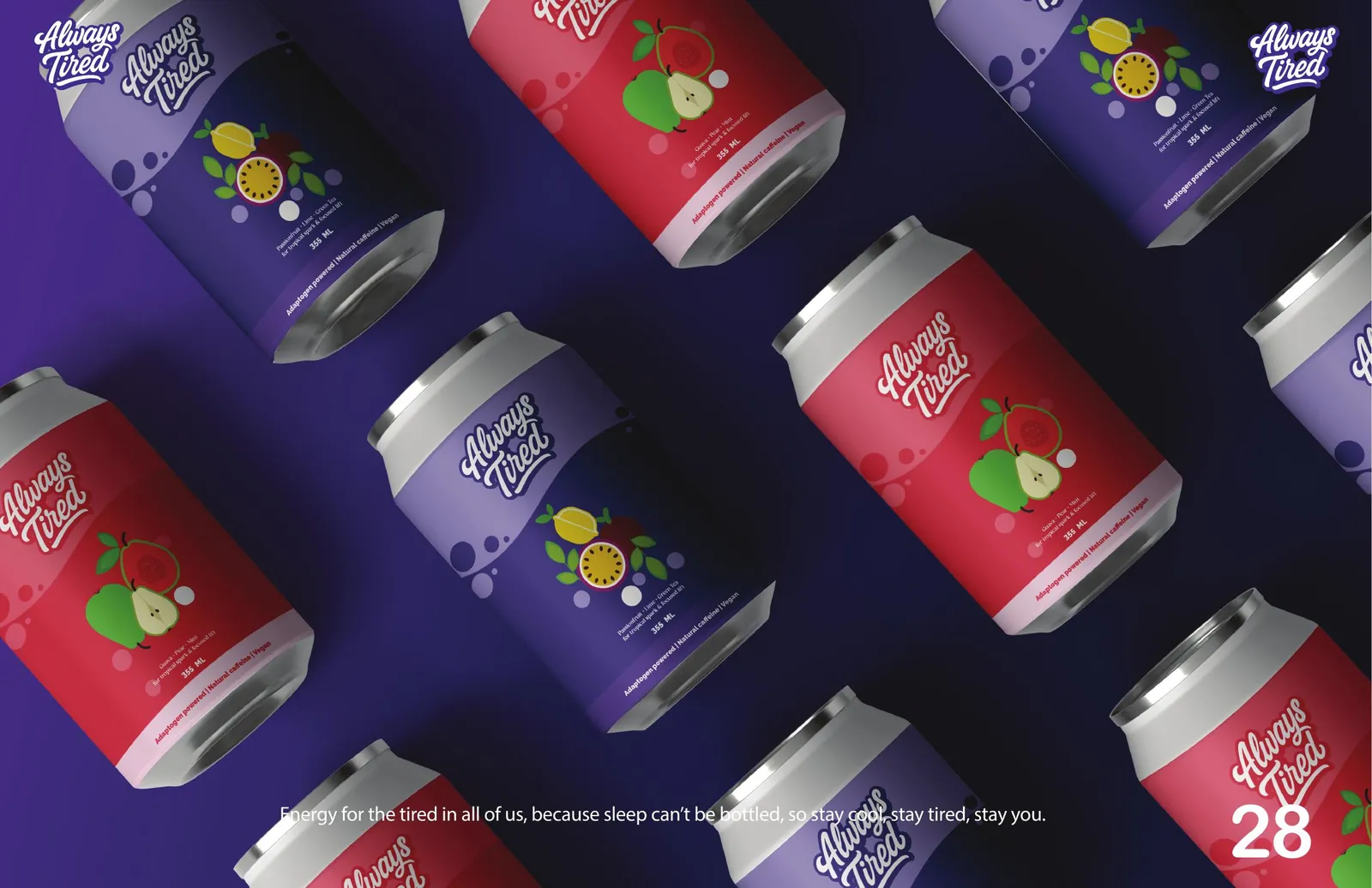
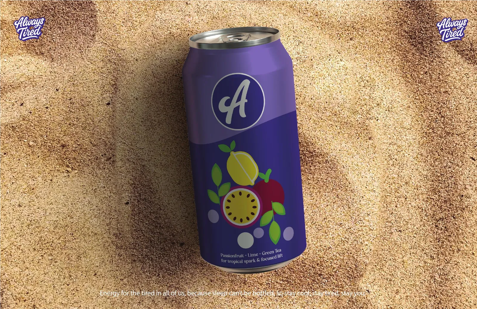
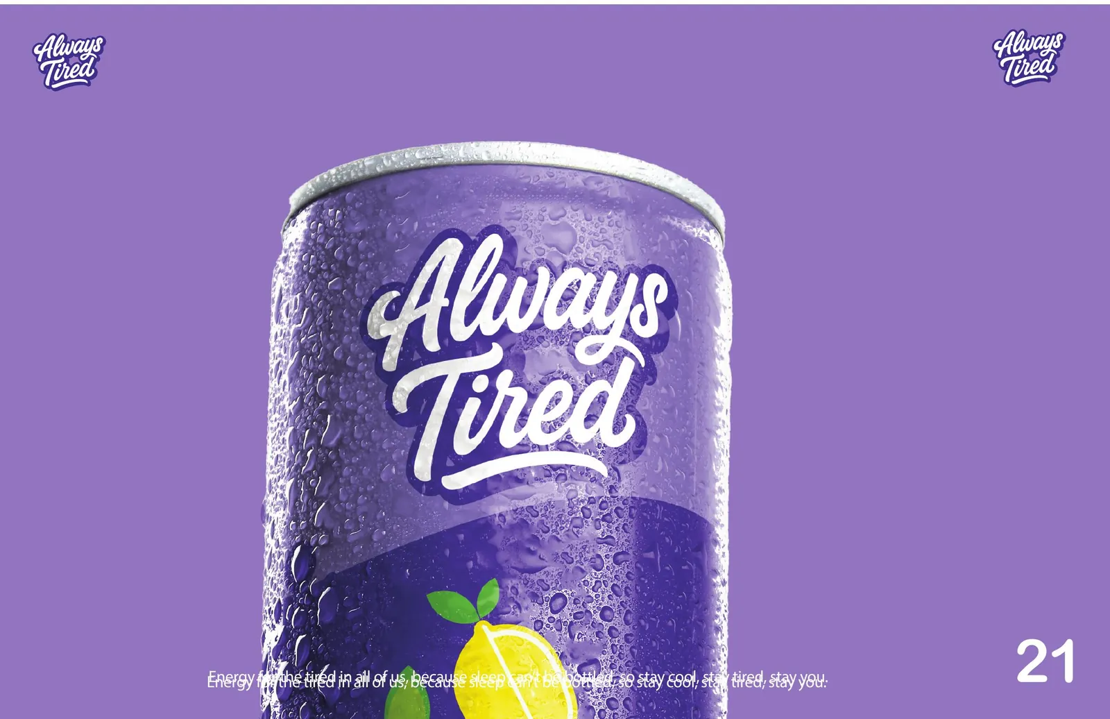
Most functional drinks sell you a better version of yourself. This one starts by admitting the state you're in — and the name does that work before the can is even opened. A relaxed script wordmark keeps it human, while a circular A monogram gives the range a badge that reads at ten paces on a cooler shelf. Playful, real, no overpromises.
The outcome
A new shelf position between wellness and culture.
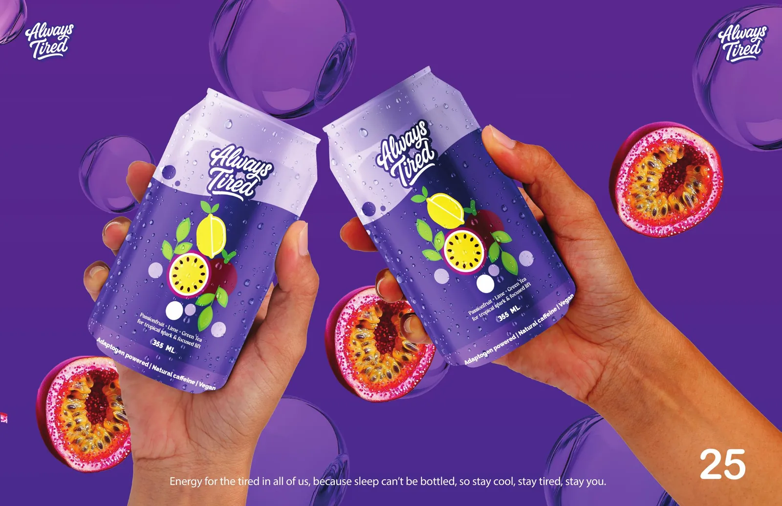
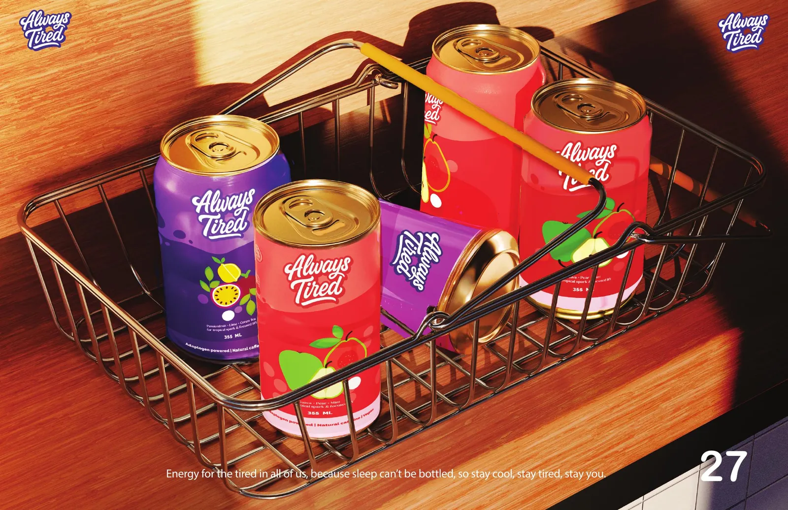
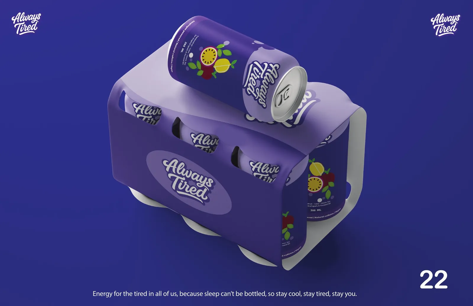
A high-contrast palette that pops in a cooler, a can system across flavours, and a verbal identity aimed at the burnt-out tribe — Gen Z, hustlers, creators and everyday dreamers who are constantly plugged in and running on empty. Mid-day rescue, late-night recovery, after-grind reset.
The system
Electric Yellow
#FBDD00
Signal Red
#F04E49
Fresh Green
#72BF44
Deep Violet
#46308C
Berry
#82153B
More from the book
Next project